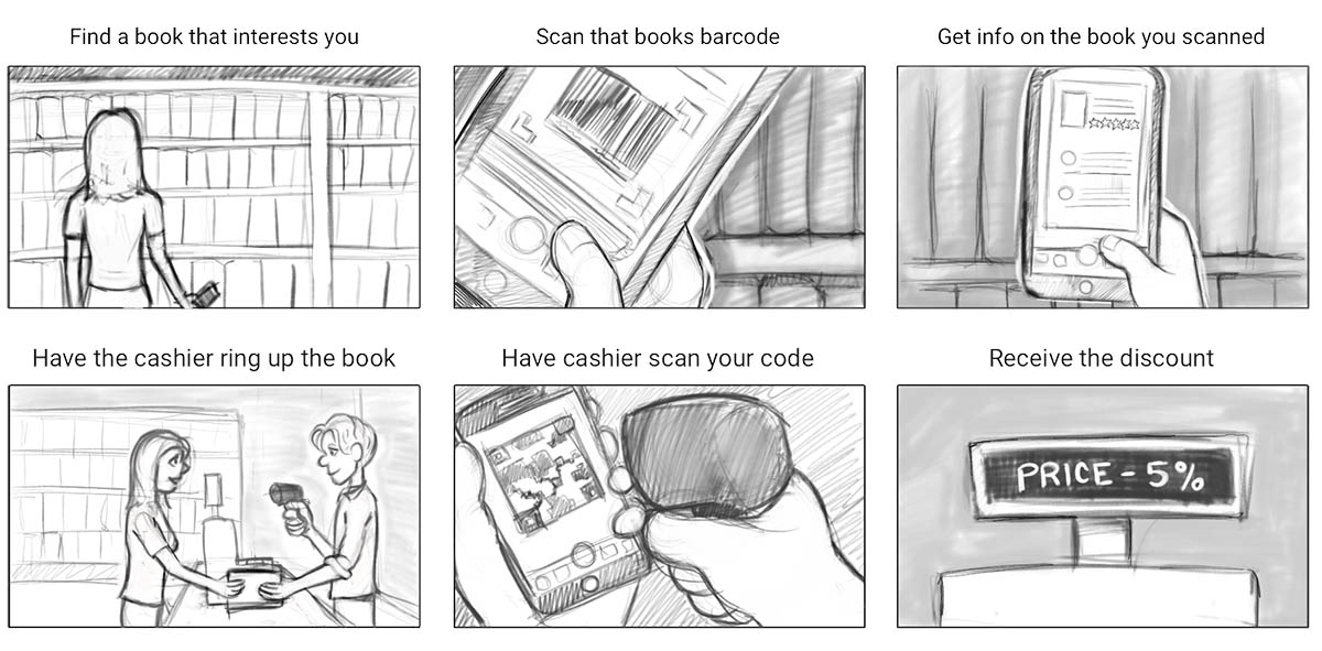
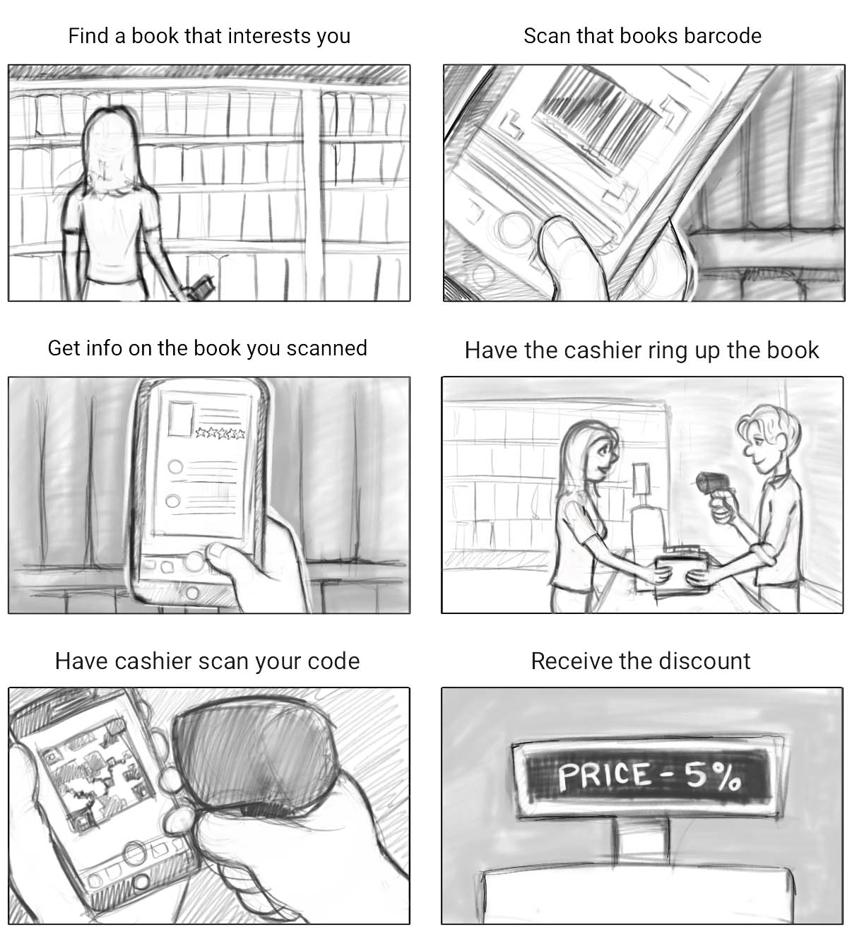
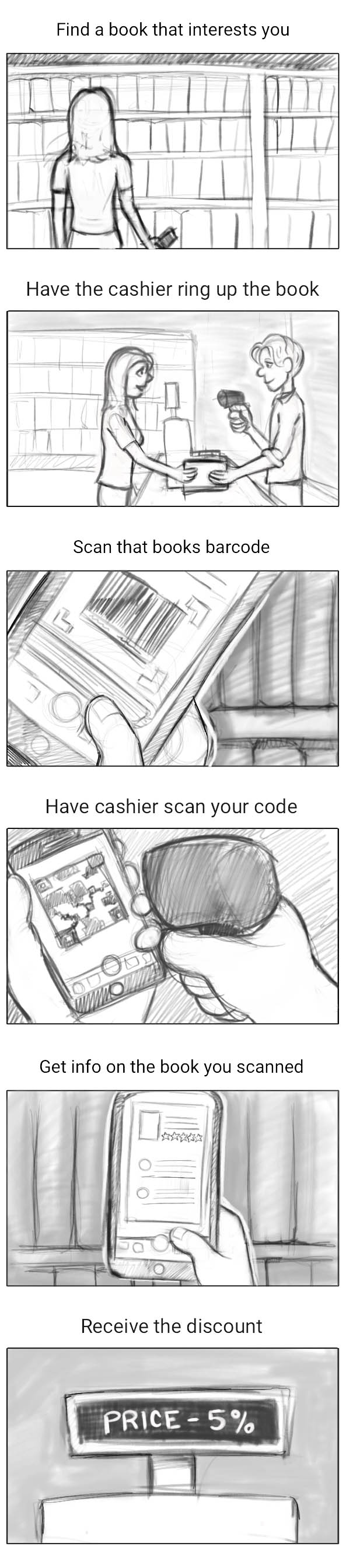
The development of a storyboard that details the vision of this solution was a crucial first step, as the strategy on paper wasn't concrete enough to move forward. Visualizing the app in action helped the team understand what we would be creating.
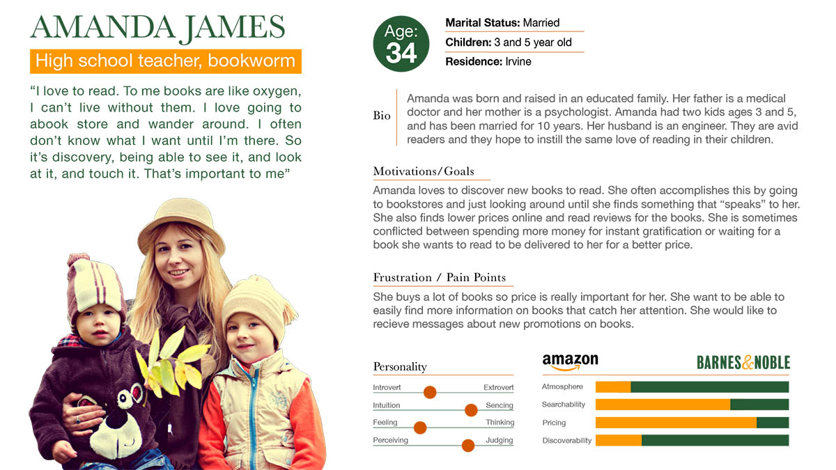
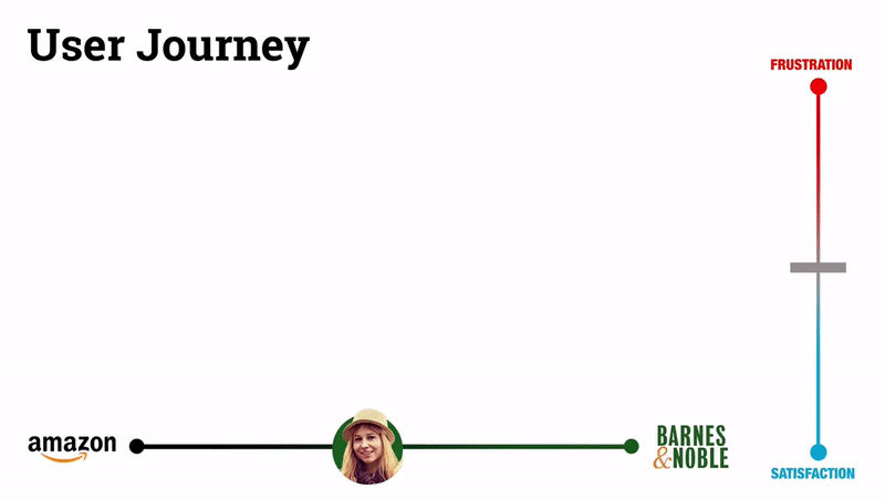
The user persona was crafted as a bit of a composite of the Barnes and Noble customers who were interviewed, mainly because most of the the answers to the interview questions were so similar. The user journey was also crafted based on overwhelmingly common experiences shared with the team by the interviewees.
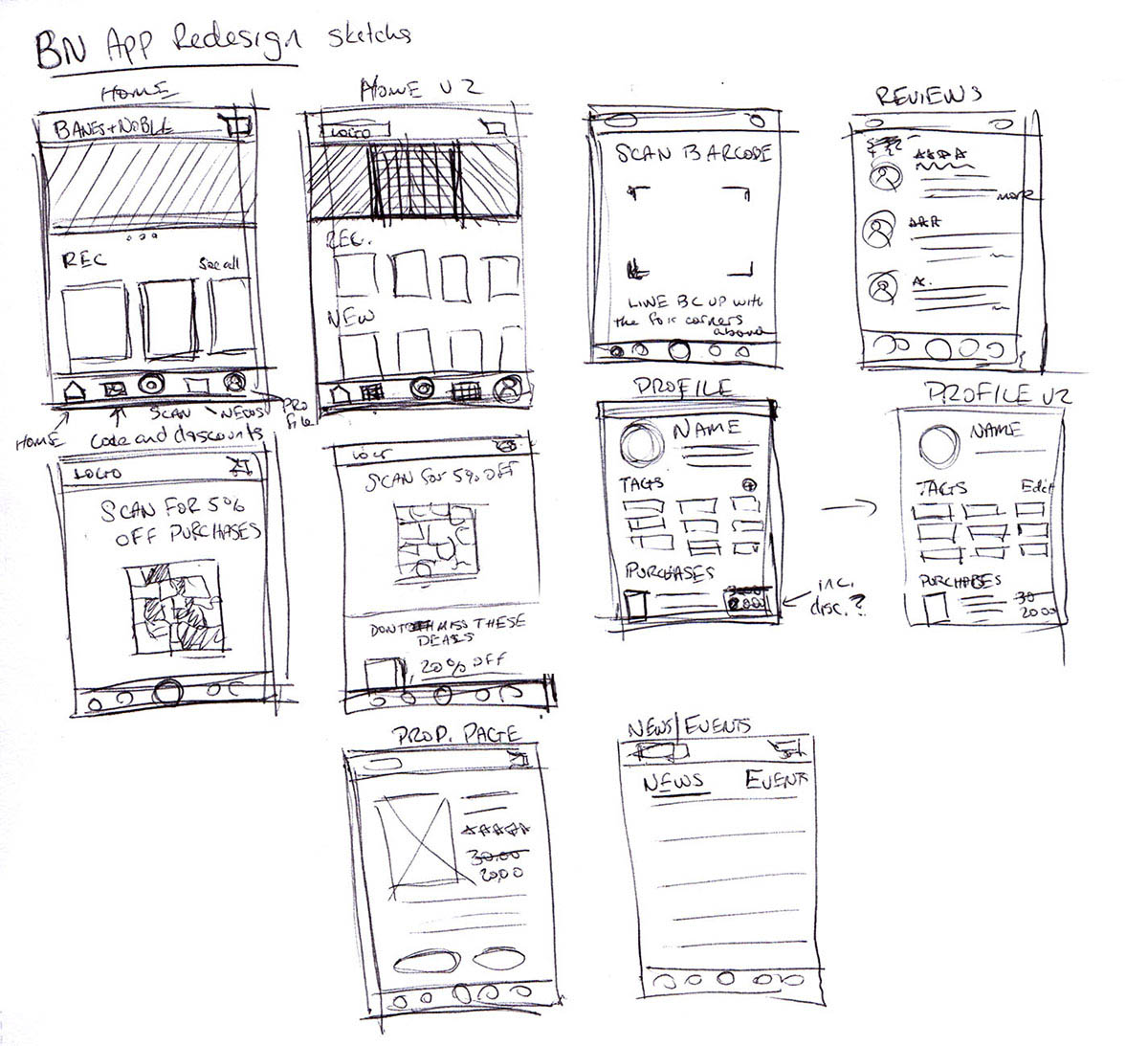
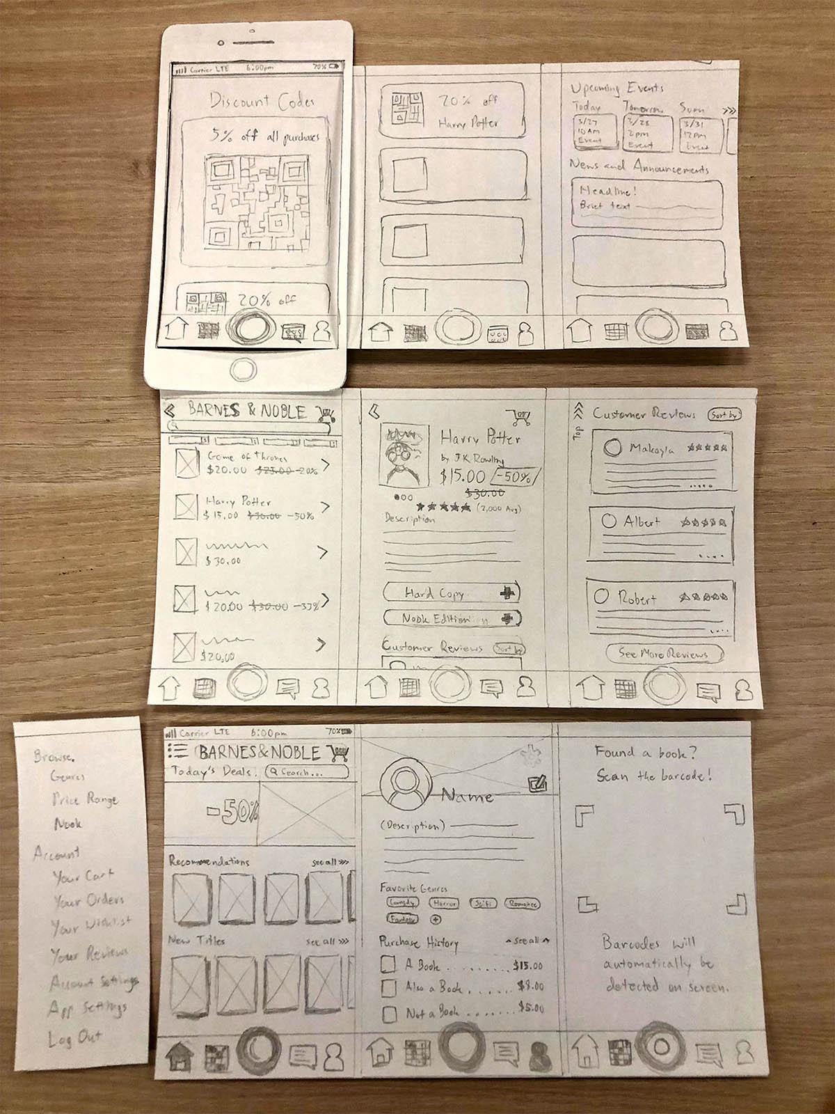
Sketches of the layout and development of a paper prototype helped sort out what the elements of the app would roughly look like as well as their general placement.
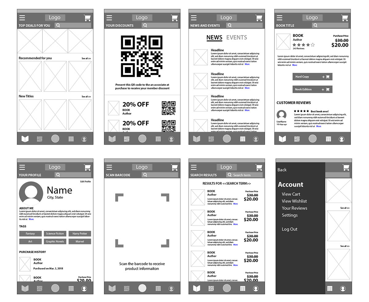
Following that was the first of two sets of wireframes where the layout of each page, the sizing and spacing of elements, and the iconography all became more developed. Preliminarly feedback on this iteration indicated that the design seemed "busy". The second iteration would address this by simplifying the layout.
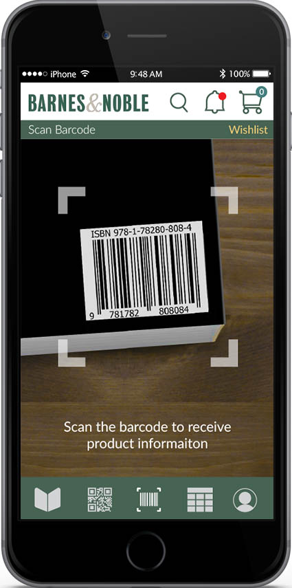
The second set of wireframes refined some of the iconography for further clarity (i.e. the barcode scanner went from a lens to something that more literally communicates "barcode scan"). The layout was also simplified in ways that helped improve usability:
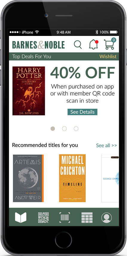
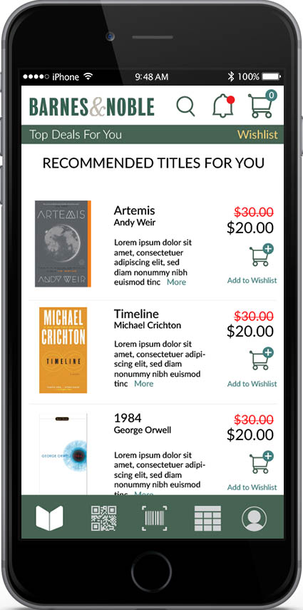
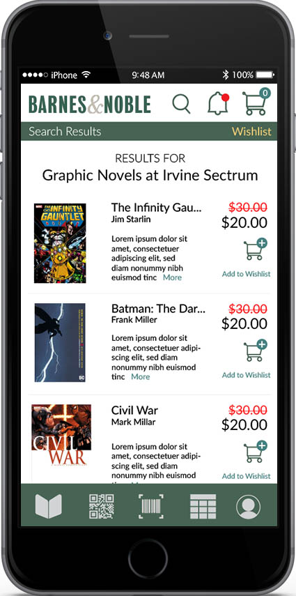
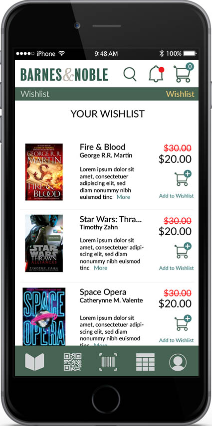
- Giving the viewer fewer clickable items and taking the opportunity to make elements on the home screen and search results larger.
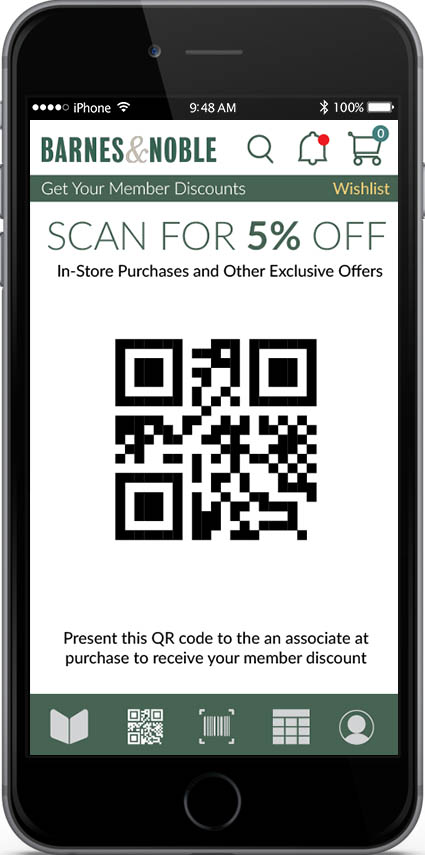
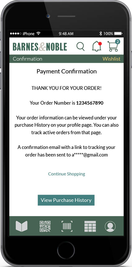
- The QR code screen only has the 5% code, as we realized the additional codes below it were redundant.
- The top navigation had elements either left or right justified and not centered, which gave the navigation less of a feel that the elements were floating relative to the design below it. User feedback indicated that of the two iterations this navigation was preferred.
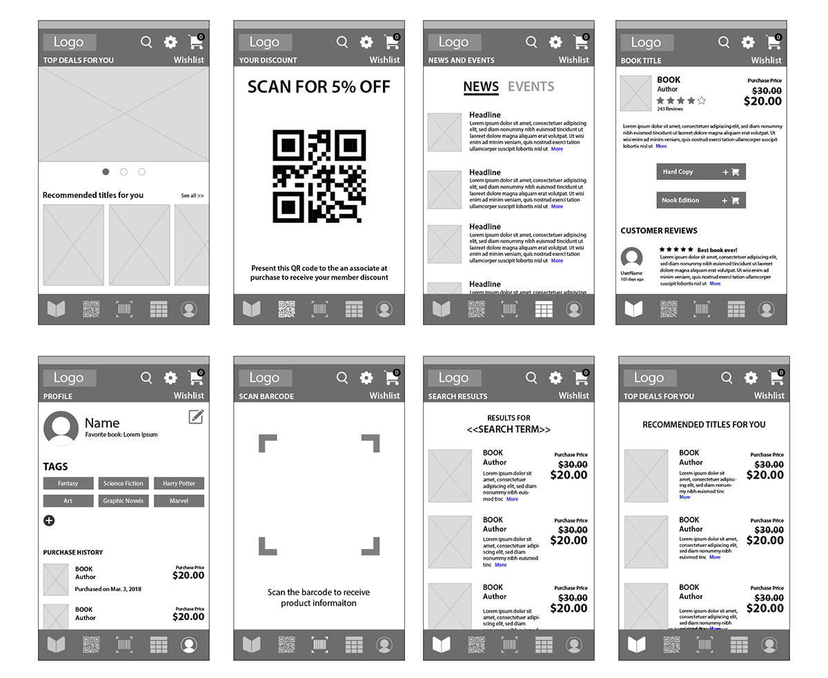
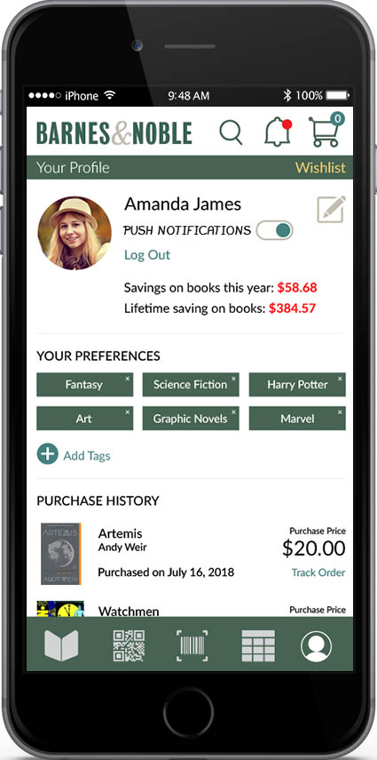
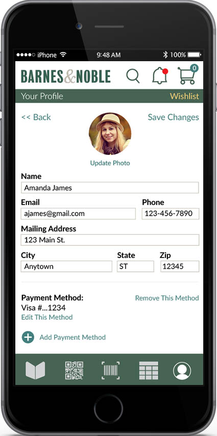
This iteration also saw the elimination of the hamburger menu in favor of a layout that didn't require one since all of the apps features could be accessed in the top and bottom navigation. The placement of which depended on the likely frequency of their use (with the features more likely to be used being on the bottom).