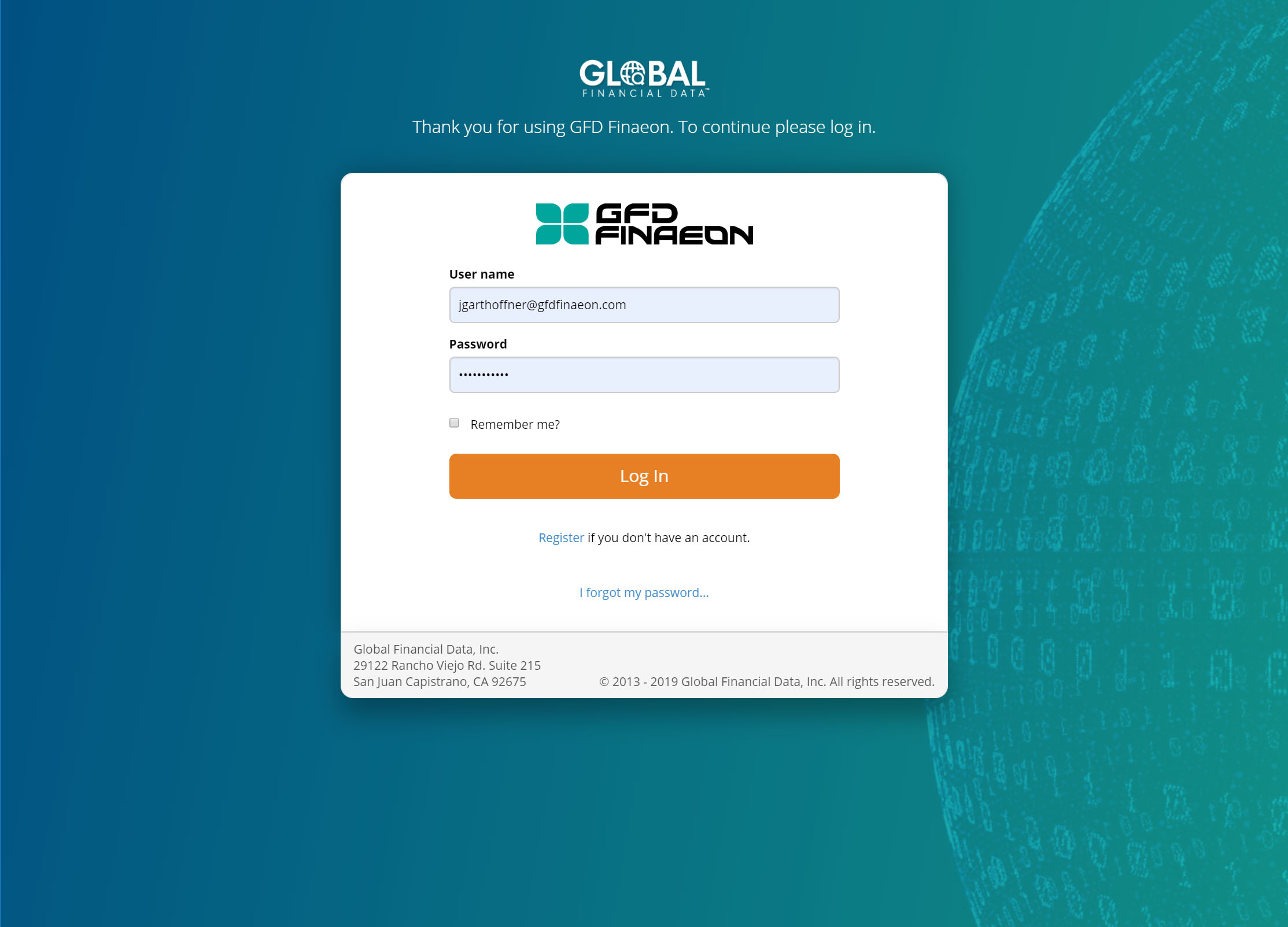
 The log in screen now contains more UX friendly language letting the user know they using a product of Global Financial Data (which is something clients of the company have been confused about in the past), and instructing them on what to do next. The background color allows the login form to become the visual focal point with the orange "Log In" button standing out as the only element with that color.
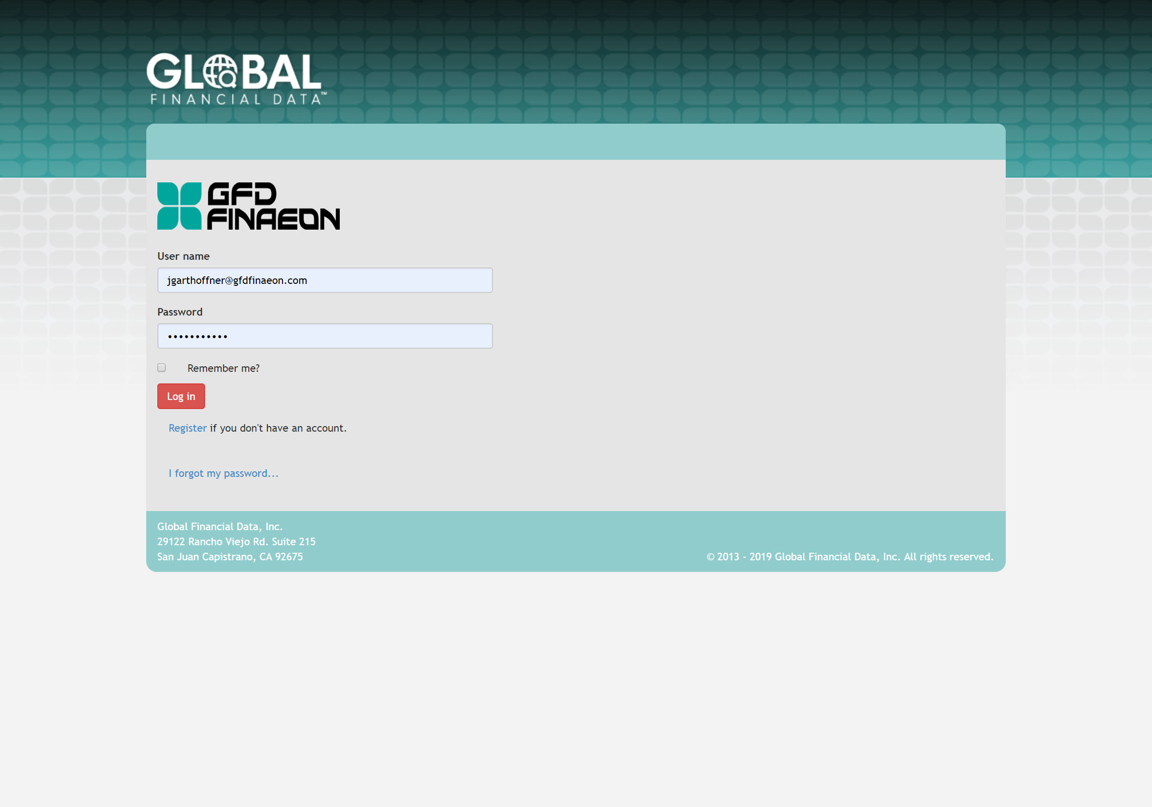 The old log is largely off-brand, and could stand to more effectively use visual hierarchy and real estate. The form practically blends in with the background. The similar weight given to the both the company and platform logos communitcates uncertainty as to where the user has landed. Elements of the form aren't properly aligned.
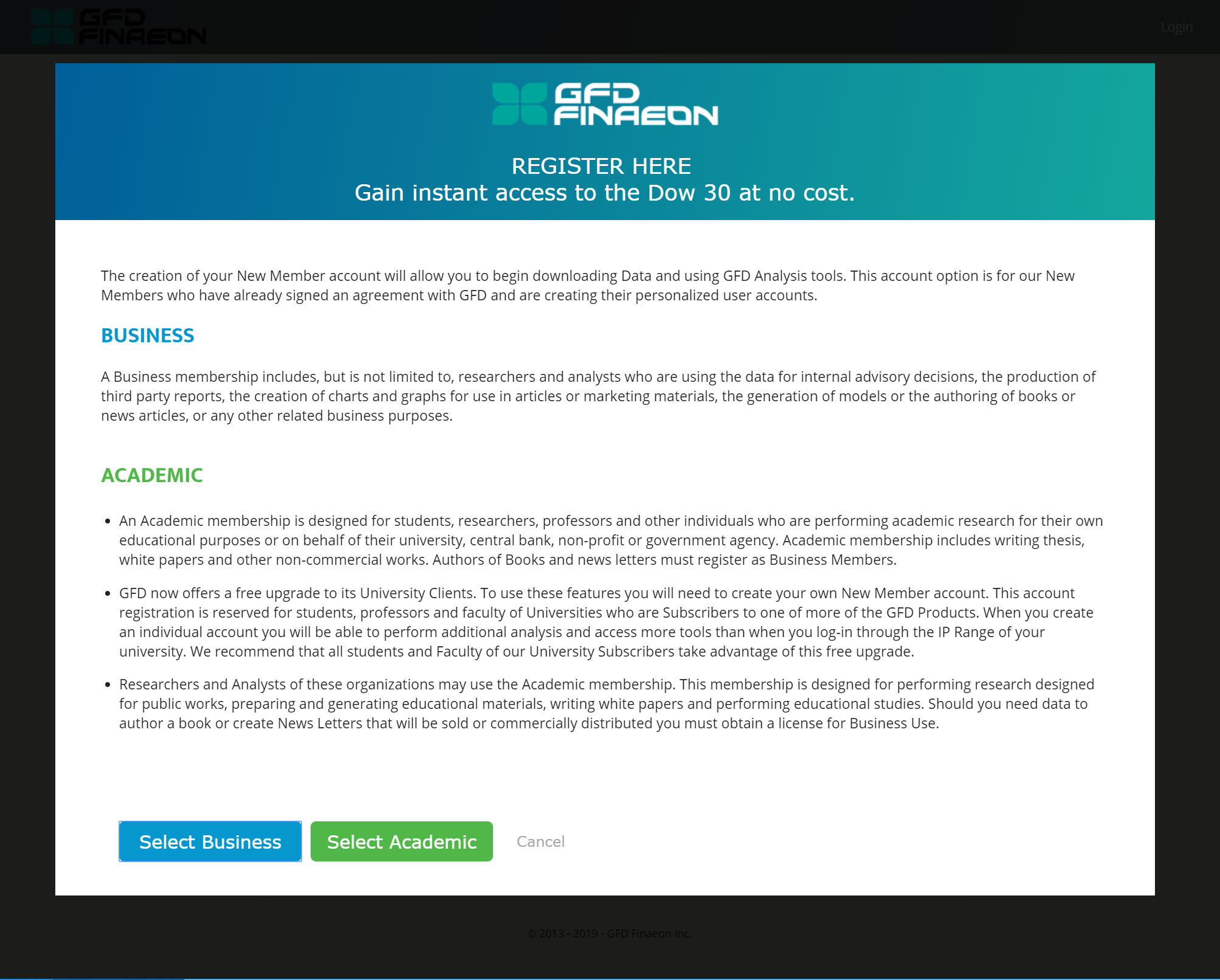 The new account selection modal has several improvements: The look and feel is less like the default Bootstrap styling of the original (the "Before" tab), and more in line with the corporate site (since that is most likely how the user accessed the registration page in the first place). Improved language communicates to the user that they are here to register, and what the benefit to registering will be. The account types are color coded to allow the user to more easily differentiate between the two. Color coding the buttons to correspond with each account type. The background overlay is much darker than the previous version in order to keep the user's focus on the steps the must take before getting to the form
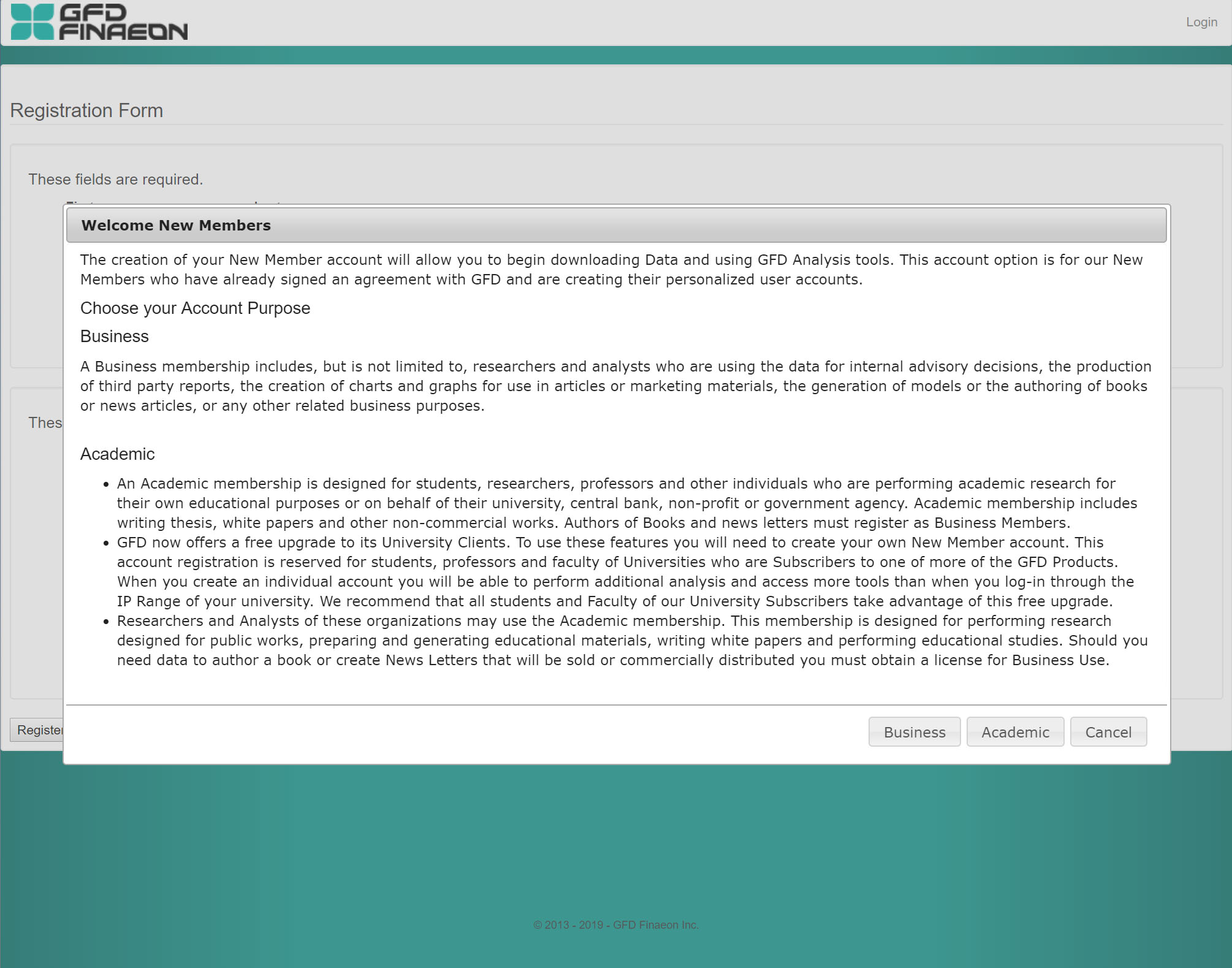 The old account selection modal's overlay provided virutally no contrast with the registration form in the background, making the experience of navigating this part of the registration difficult. There is also no styling to create visual heirarchy or visual cues to draw the user's eye along to the next step of the process.
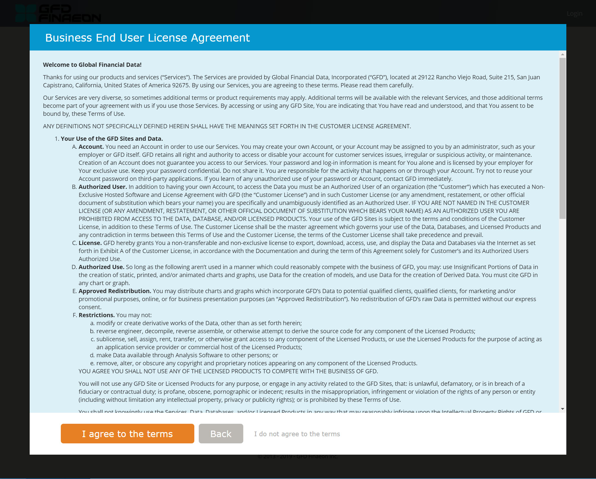 The terms acceptance page is now "color coded" in that the background color reflects whichever account type the user clicks on (blue for "business" and green for "academic"). This is meant to visually confirm the user's choice. The buttons adopt more explicit language that explain exactly what the user will get when they are clicked. The "I agree to the terms" button takes on the call to action orange to be easy to spot and calls attention to itself for the user's and business's benefit.
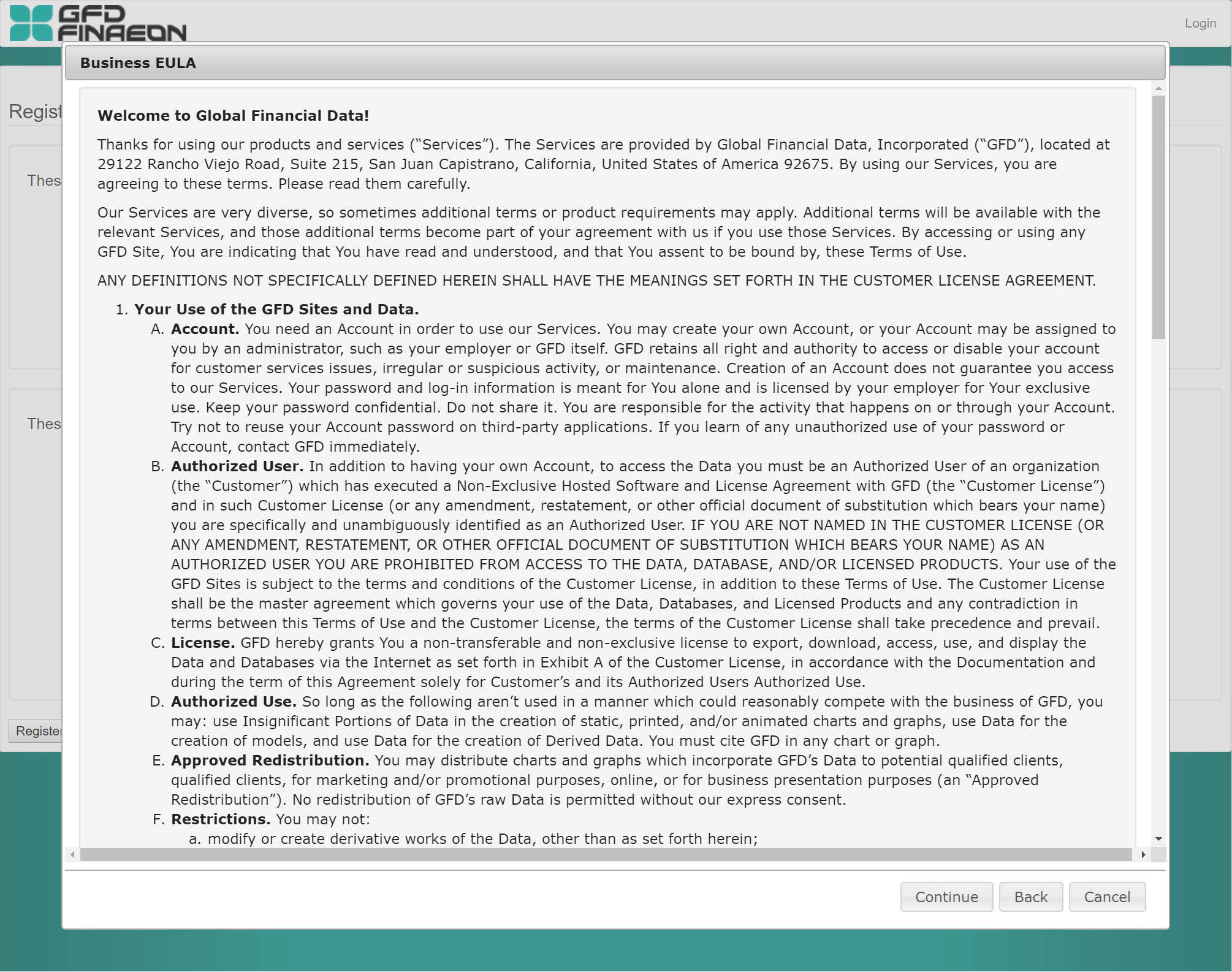 The previous version, like with the account selection form, has little contrast with the background, and doesn't leverage color in any way to draw the user's eye where it needs to go. The buttons, while not completely ambiguous, are visually identical to each other and the language lacks description.
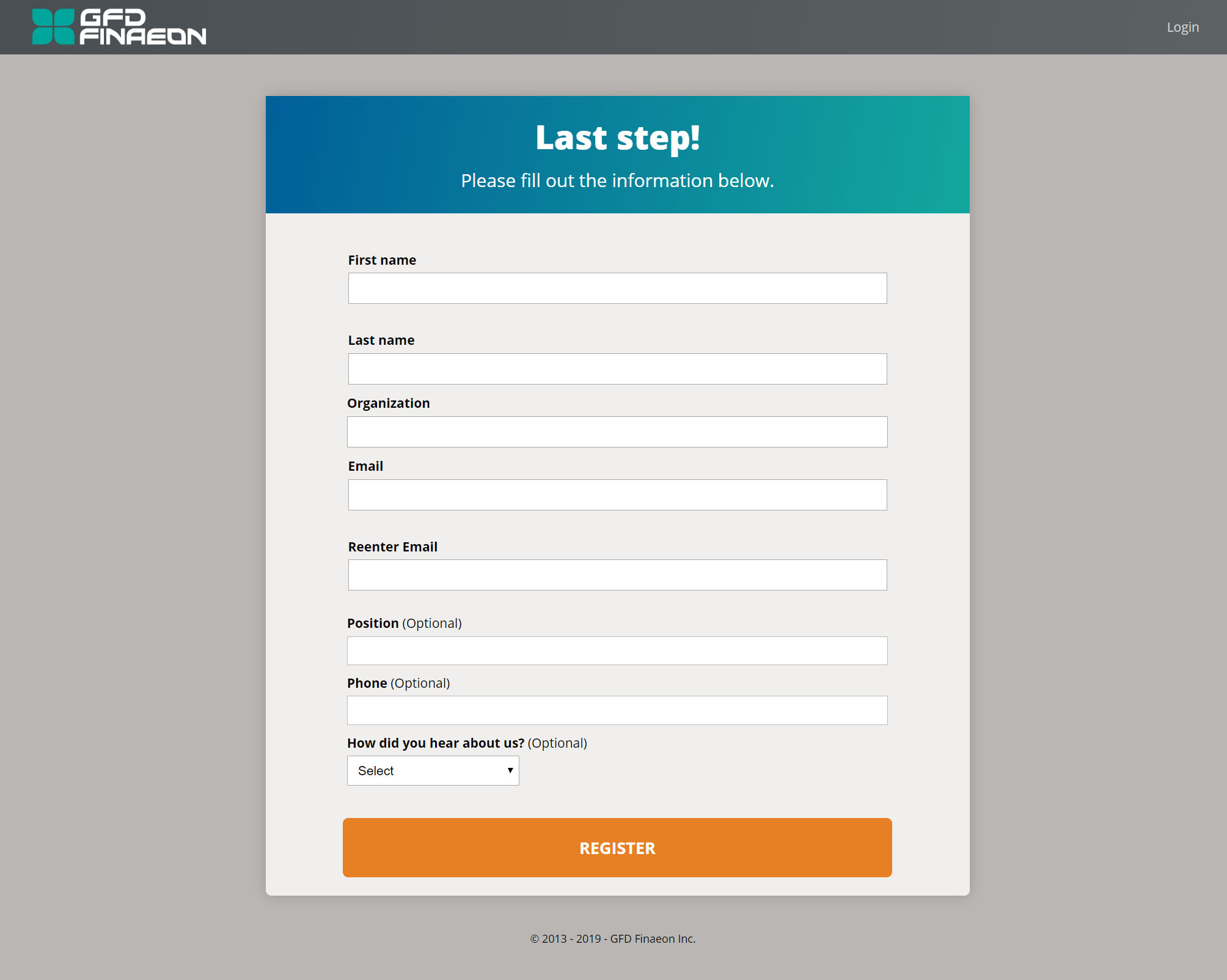 As with the rest of the registration form, color is utilized in a way to help draw the user's eye where it needs to be. Unnecessary form fields were eliminated, and language was added to let the user know they are almost done with the process.
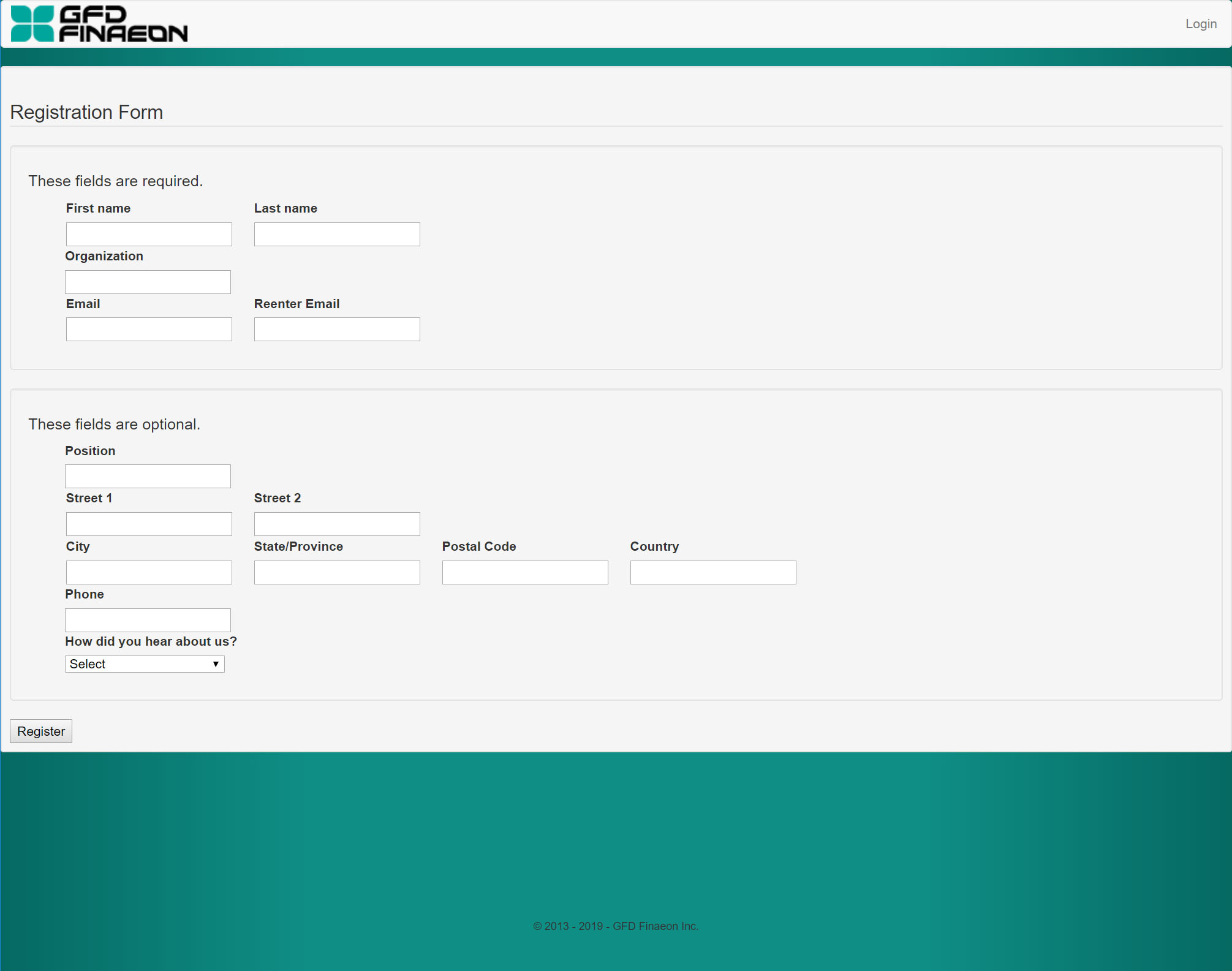 As with the previous parts of the old form, color isn't utilized at all, so the eye doesn't get drawn to where it needs to be. There are too many form fields, and they are "stacked" in a way that doesn't follow best practices for online forms. The registration button is virtually invisible.
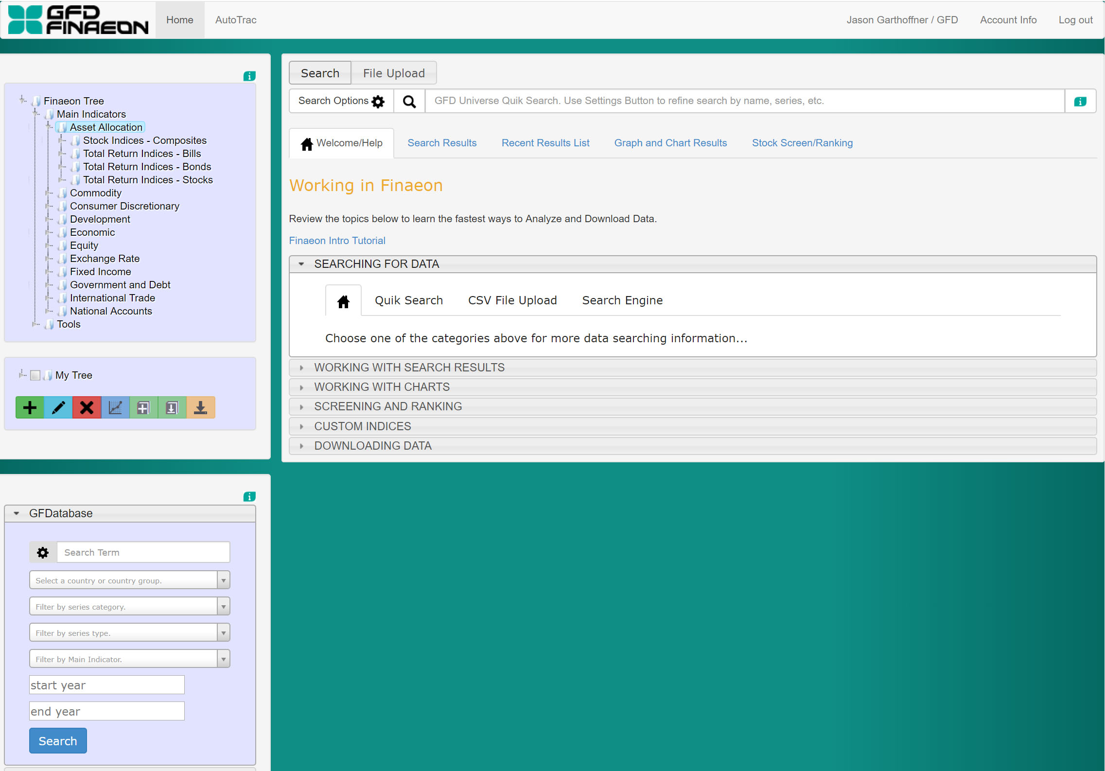
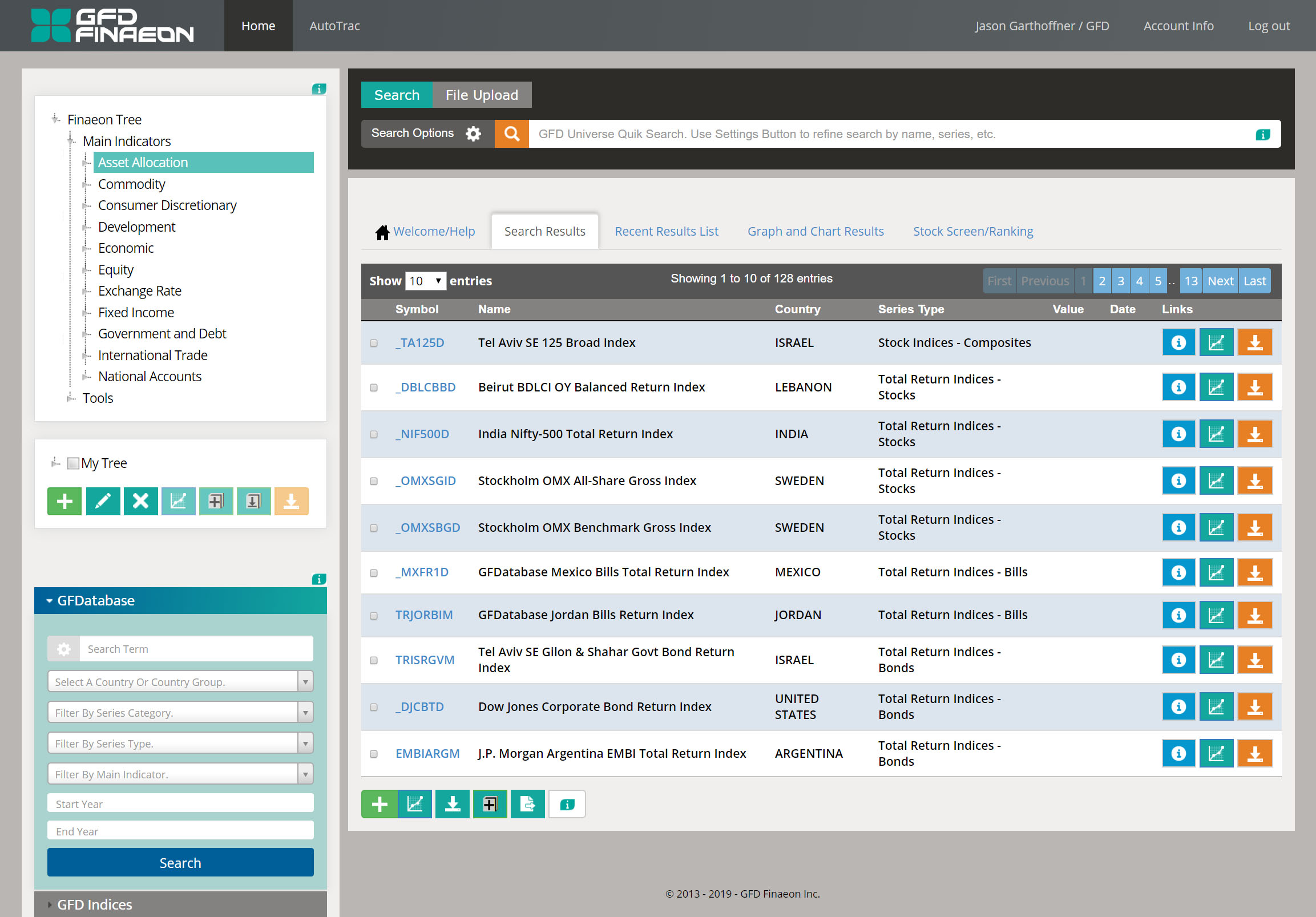
 Color is employed more effectively. The greatest contrast goes to the search bar, which has been indicated by the sales team (as conveyed by users) to be the most used part of the interface. The search button (magnifying glass) is in the same CTA orange users see on Global Financial Data's corporate website, this combined with the search bar having the darkest background on the screen makes it much easier for the user to spot. In the previous version it blends in so much with the background that it's very difficult to identify easily. The same is true of accordion navigation, as it is now easier for the user to identify both the accordion tabs and which section has been selected. The background of the body is given a more neutral color to allow the interactive spots where color is used to pop more.
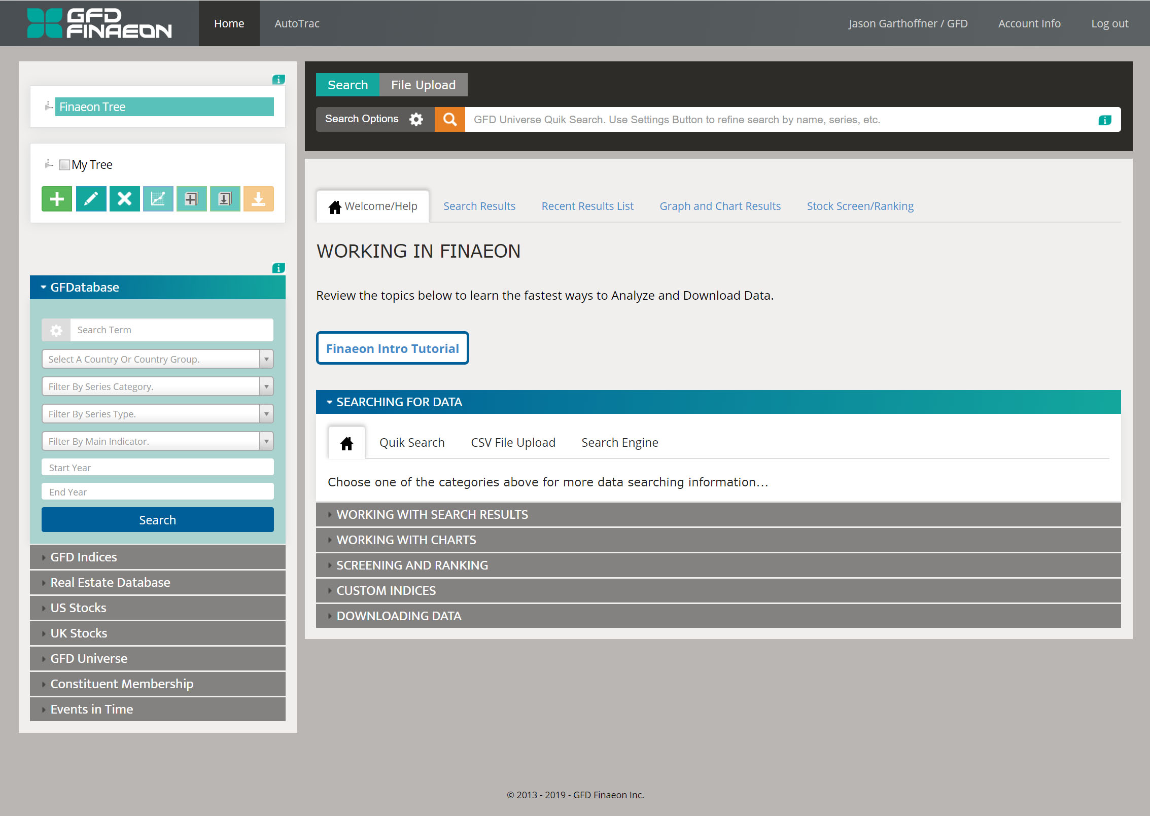
 The same issues plaguing the registration and login process also occur on the main interface of the platform. Not leveraging color contributes heavily to a lack of visual hierarchy that would help the user better know where to start, what to do, and how they are navigating the interface. The strong green background is off-brand, and with the other issues surrounding the (lack of) use of color there is a potential for problems with overall usability.
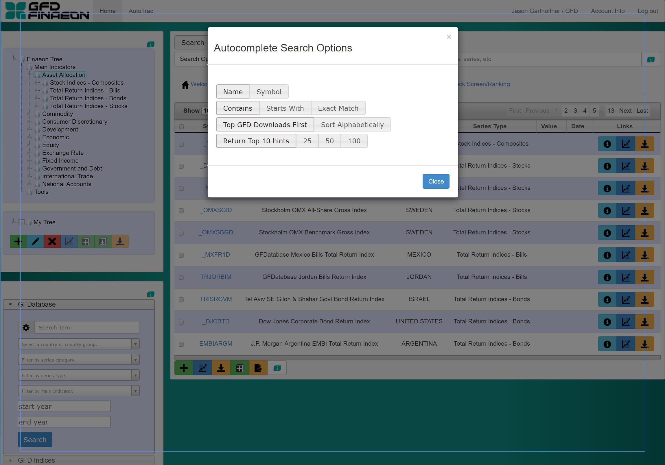
 The search options modal is now branded, it includes language to guide the users on how to use the modal, and has a clear differentiation in color for the user's selected options.
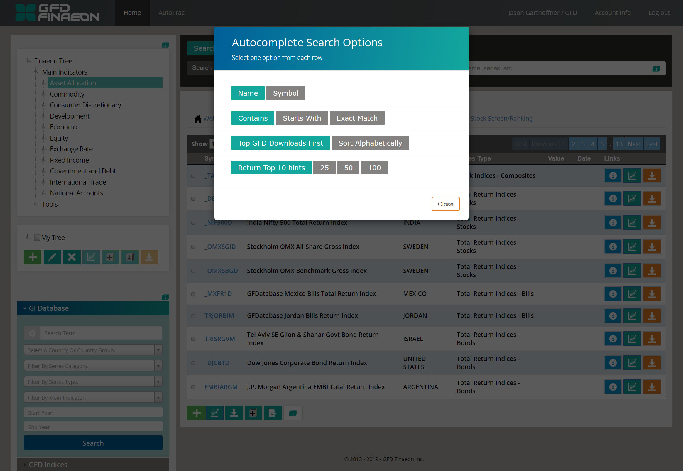
 The previous version of this modal has no branding, no visual cues that each row is a grouped set of options, no language explaining what the user should do, and styling to show the difference between what is selected and unselected is virtually nonexistent.
 The "Finaeon Tree" (on the top left) was simplified. The icons next to the branches were removed, as they didn't serve a purposed that enhanced usability, the tree was styled to make the user's selection more identifiable. Despite not being actual links, the items in the search result "name" column were in certain instances wrapped in HTML "a" tags, giving the impression they should be clicked. This phenomenon was eliminated in the update. The brand of the company is reflected in the colors used (with the data download icon, the end goal for users, in the regular CTA orange), and the icons are made white for better contrast and visibility.
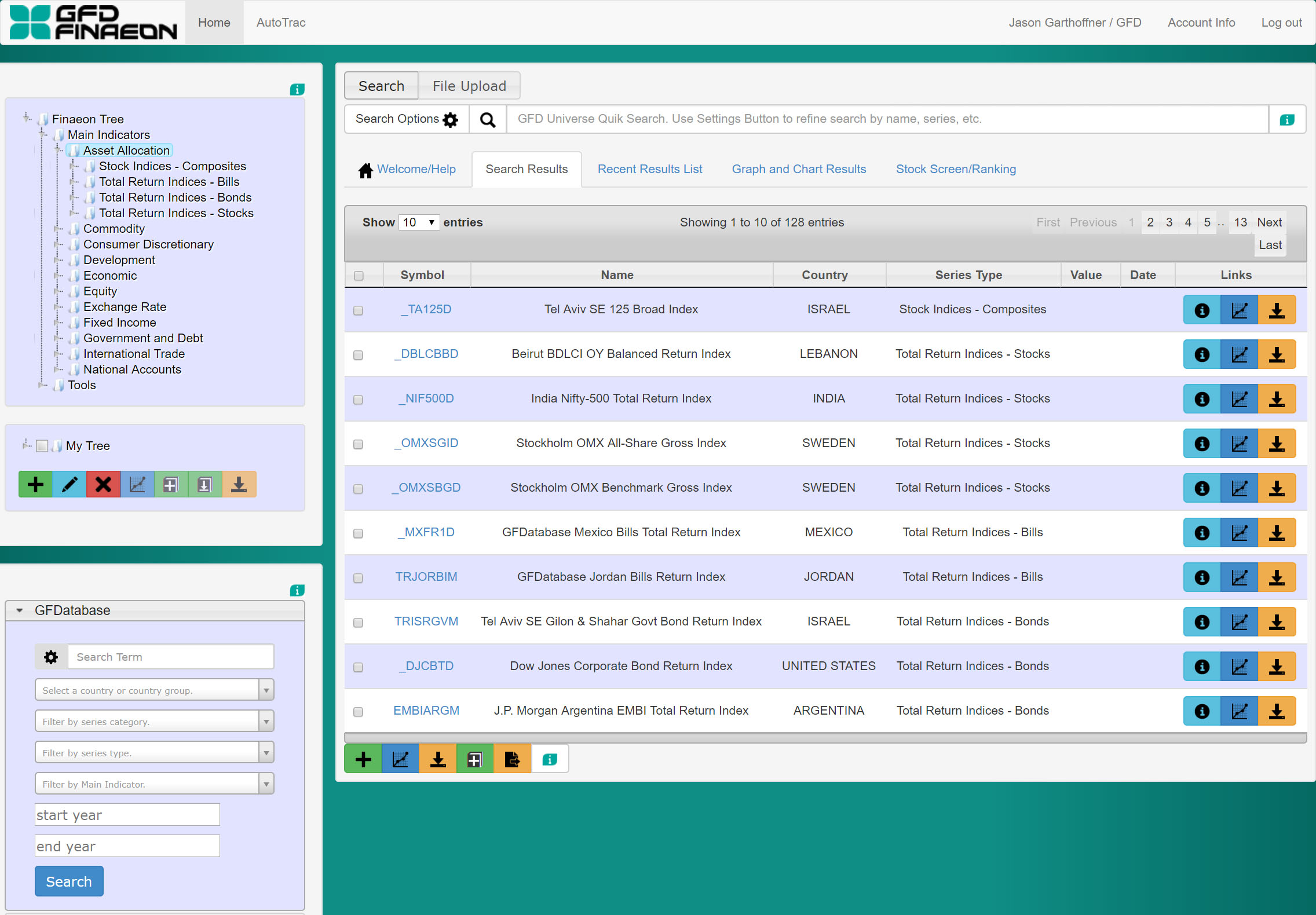 While color is used a little bit here in the background color of the icons, there is no cohesive rationale for its use from a branding standpoint. The black color of the icons make some of them hard to see against darker backgrounds. Icons in the "Finaeon Tree" to the left are all the same which calls into question their purpose.
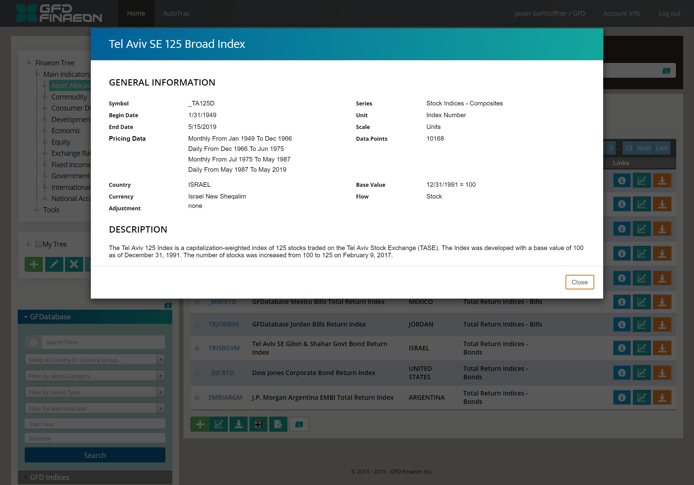 The modals now take on a more branded look in its use of color and font. The background behind them has been made darker as well to help them pop on the screen more, especially for the blue-teal gradient.
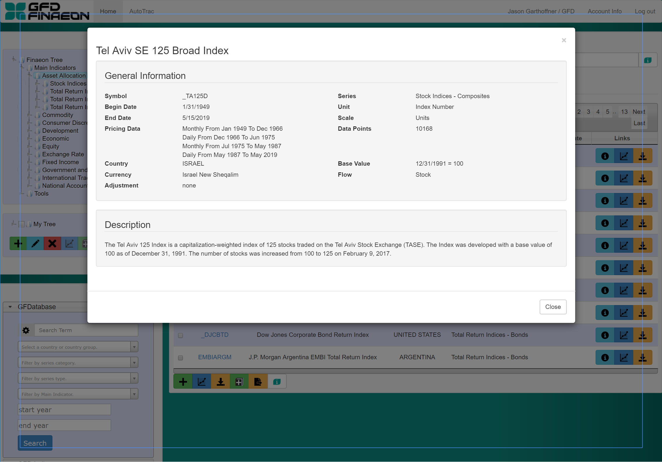 The styling of the old modals looks like the default Bootstrap setting. This is especially evident with the presence of the blue outline outside the apparent container of the modal (which was eliminated in the update).
Back to top