The Process
It was clear that the first task was to get an understanding of the website's content and figure out how to address the first and second insights, as solving for the other issues would flow out from this.
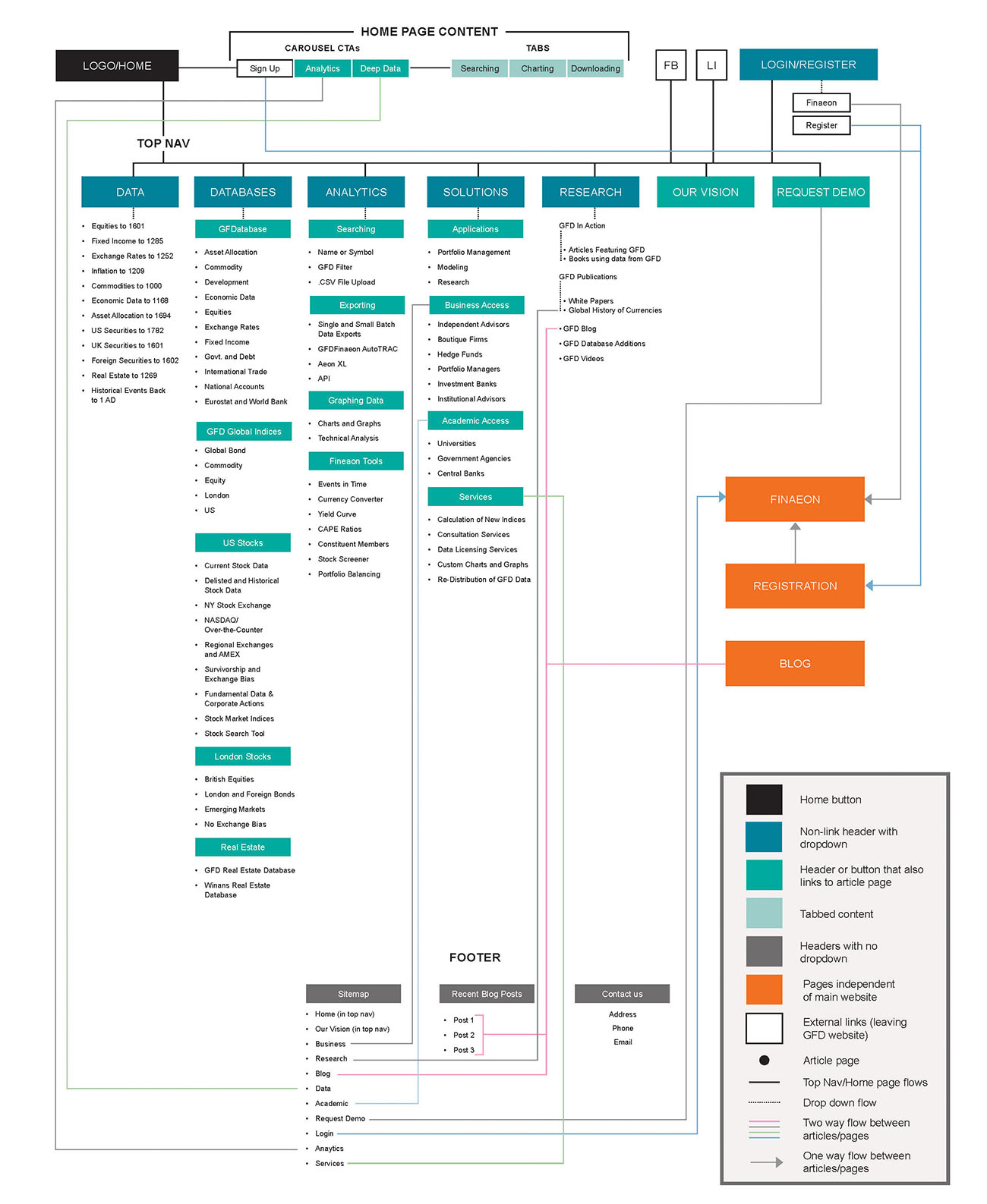 The old website had over 80 pages of content. Navigation was not intuitive because links were inconsistently labeled (i.e. "Business" in footer, and "Business Access" in the top navigation) and some sections were only accessible via the home page or footer (i.e. The "Deep Data" page could only be found at Home or by clicking "Data" in the footer)
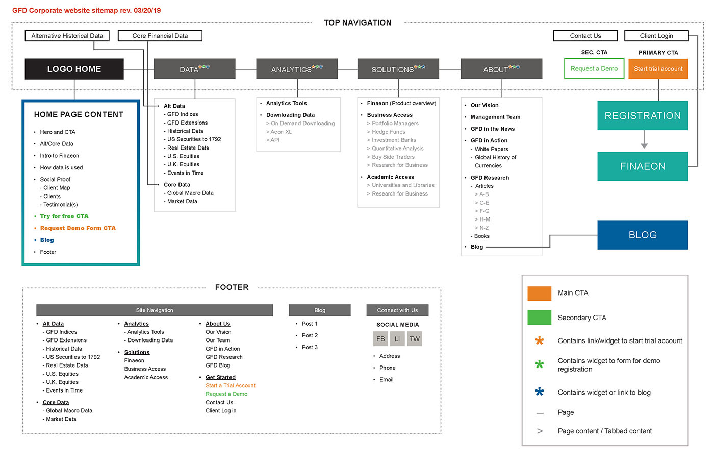 The new design sought to cut the number of pages by about 70% by consolidating similar content, presenting a navigation that was more intuitive with greater clarity and consistency of how the links are labeled and where they are located. The overall goal being a site that wont overwhelm with content, and is easier for the user to move from one section to another.
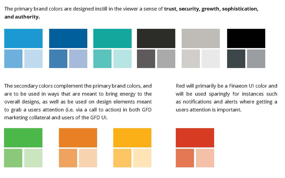
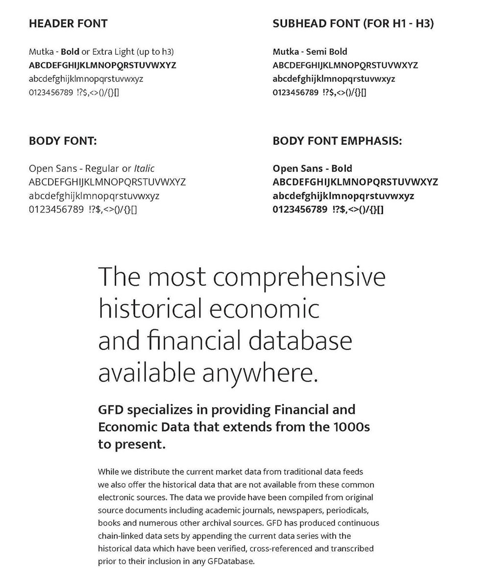
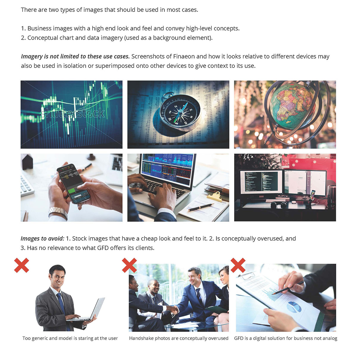
The next step was to create some guidelines for how color, typography, and imagery should be used. This was a helpful reference for me and the stakeholders.
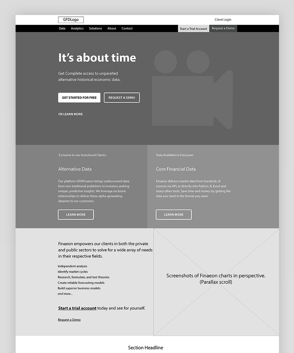
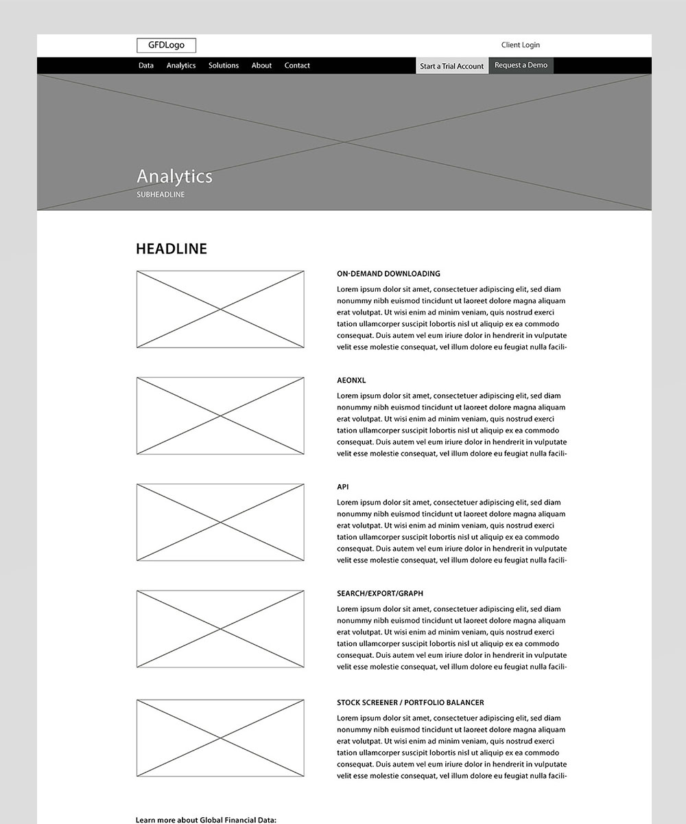
All of this was brought together to begin creation of wireframes, first in black and white, and later high-fidelity color wireframes were developed.
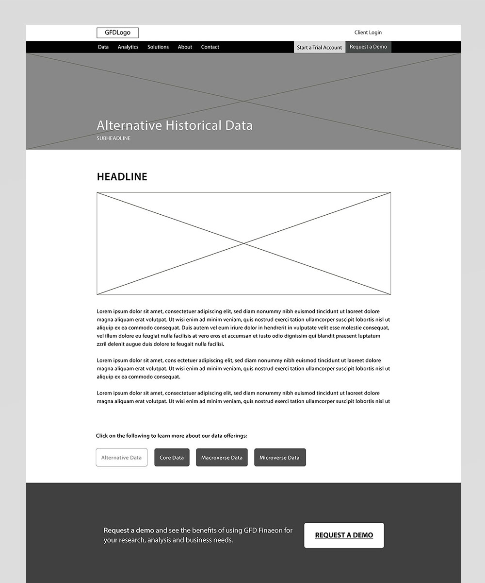
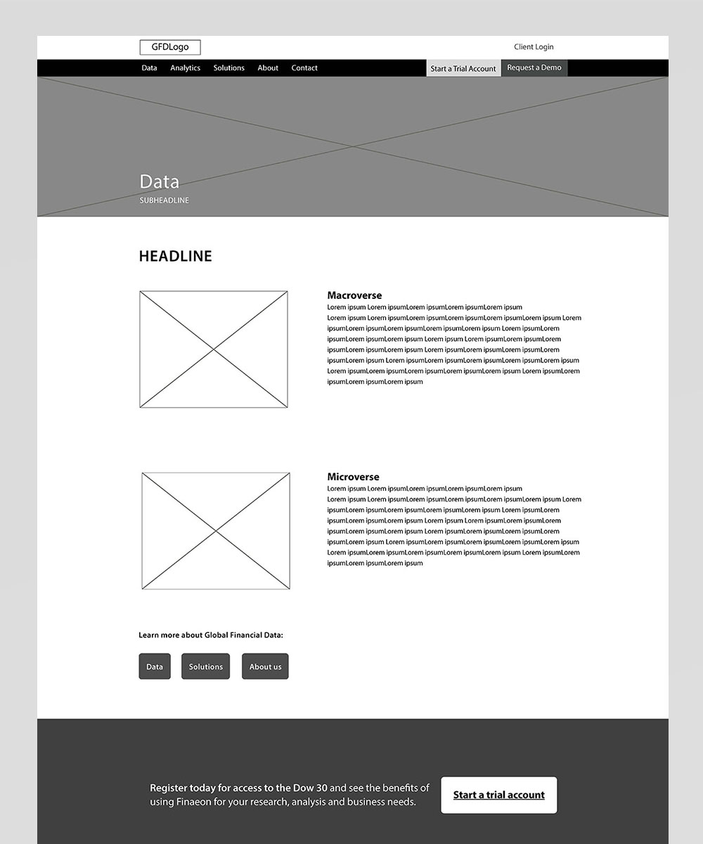
 The general "article" page template. Each page features a section "navigation" that helps spur the user on to the next page. Also included on every page are the calls to action for account creation and demo requests that are seen on the home page.
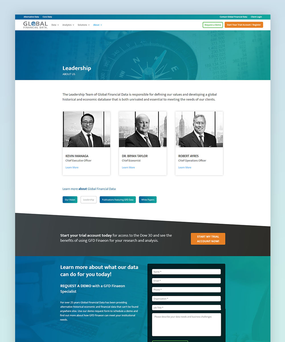 A leadership page was created to help spur a greater sense of trust with prospective clients. Clicking the executive opens a modal with their bio.
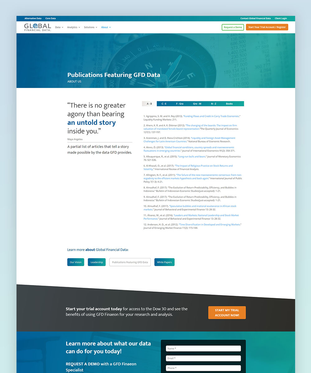 A listing of publications GFD has appeared in, the previous version was one big list for almost 200 citations. The new page uses tabbed navigation.
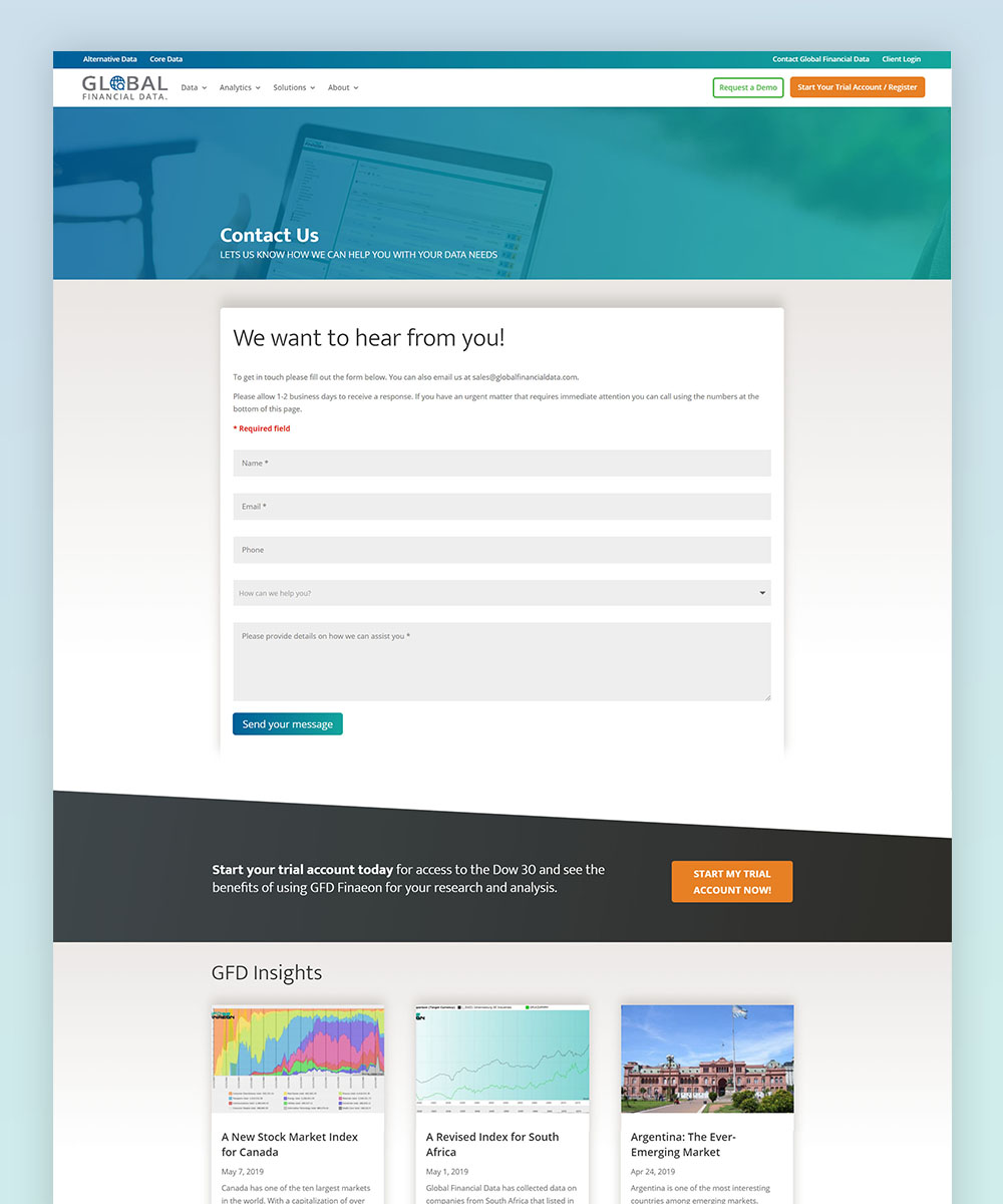 The new contact page includes previously unavailable features such as a dropdown for the subject, a confirmation message, and language considerations that help enhance the user experience.
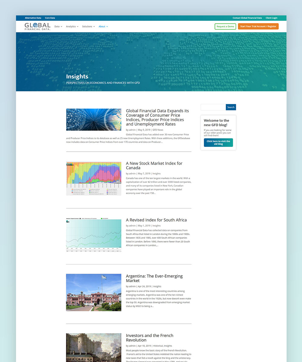 The company's blog has been renamed "Insights," and includes the ability to search posts by keywords as well as thumbnail images that are more descriptive of the posts subject matter (the previous website used GFD charts for every post regardless of relevance). .
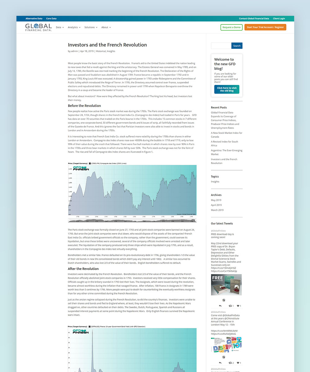 The page for the individual insights now benefit from the use of sidebar widgets that allow users to peruse a post archive, the company's Twitter feed and even visit the legacy blog.