Overview
The Work of Freedom reframes liberty from a possession into a practice. The operative word in the name isn't freedom. It's work.
There is a prevailing attitude that freedom is a given, and inevitably becomes something that is taken for granted.
Furthermore, American civic design has a vocabulary problem. Flag gradients, eagles, stars, red and blue at full volume — a language so worn it reads as taking a political side rather than weaving the fabric of a nation.
This campaign seeks to reach Americans by reminding them the society we have took work with a mix of history, heritage, and modern communication methods.
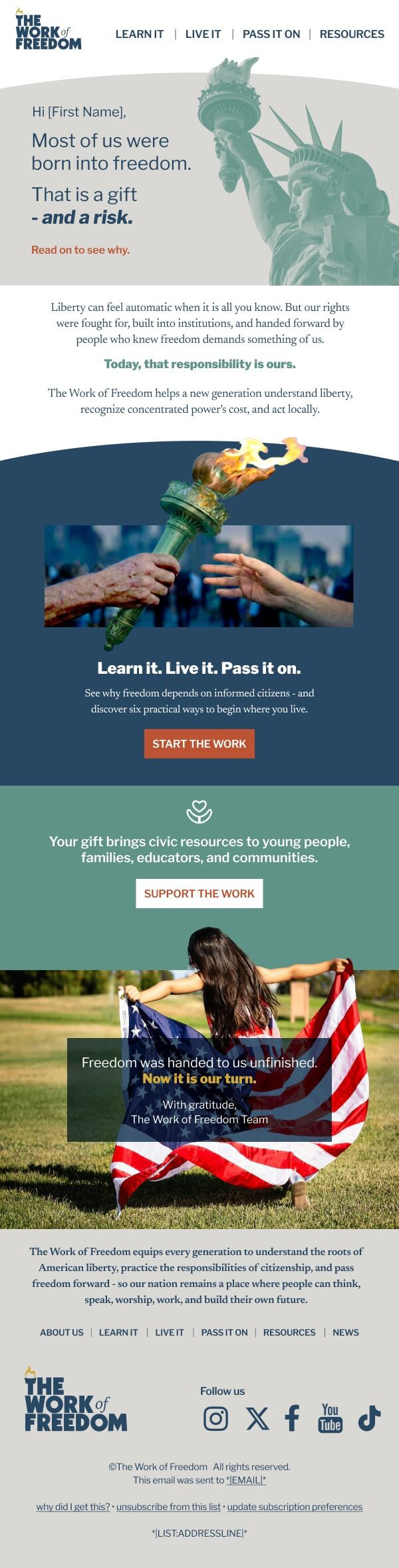
The liberty palette
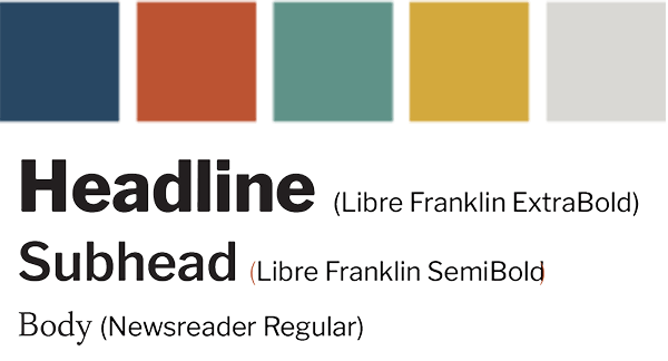
The palette taps patriotism and liberty without saying so outright. The idea is colors represent materials instead of symbols: ink navy, brick rust, weathered copper (teal), aged brass, limestone. It carries the image of the flag and one of our most patriotic symbols, the Statue of Liberty, with subtlety.
Libre Franklin ExtraBold carries the assertions in the form of headlines; a serif carries the argument in the form of the body text.
The mark
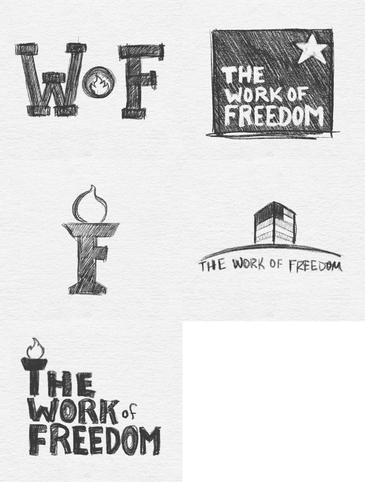
Five ideas were sketched. A "WoF" monogram — abbreviations are earned, and this campaign has no equity to spend. A star badge, killed because the star is the most politically claimed shape in the vocabulary. A torch built from the F, which stopped being a letter. An abstracted flag form that could have been mistaken for a bank.
The chosen direction is a word mark that allows the organization to become better known while still having something distinct about it that would make it memorable.
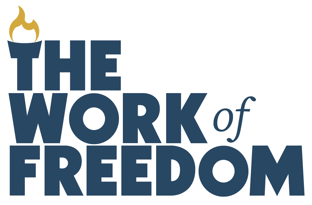
The T of "THE" flares open at the crossbar to hold a flame. Displayed simply, the letter is the torch. Implication is preferred over depiction in order to preserve simplicity and keep the entire mark presenting as a unit. The mark is also arranged to resemble steps to reinforce the concept of working up to the torch.
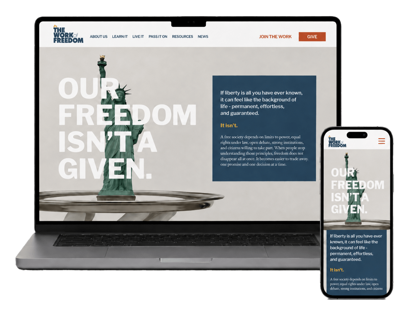
Landing page
The flagship piece for the campaign.
It’s sequenced to be more than a scroll but rather an argument for the preservation of freedom and what it takes to do it: assertion, cost, honesty, framework, action.
The page argues in favor or our heritage while also conceding that America's story isn't spotless before anyone else can say it — then lands on six concrete acts of citizenship. Read. Follow. Show up. Serve. Talk. Vote.
The page concludes with calls to action on ways to help and stay engaged.
Promotion
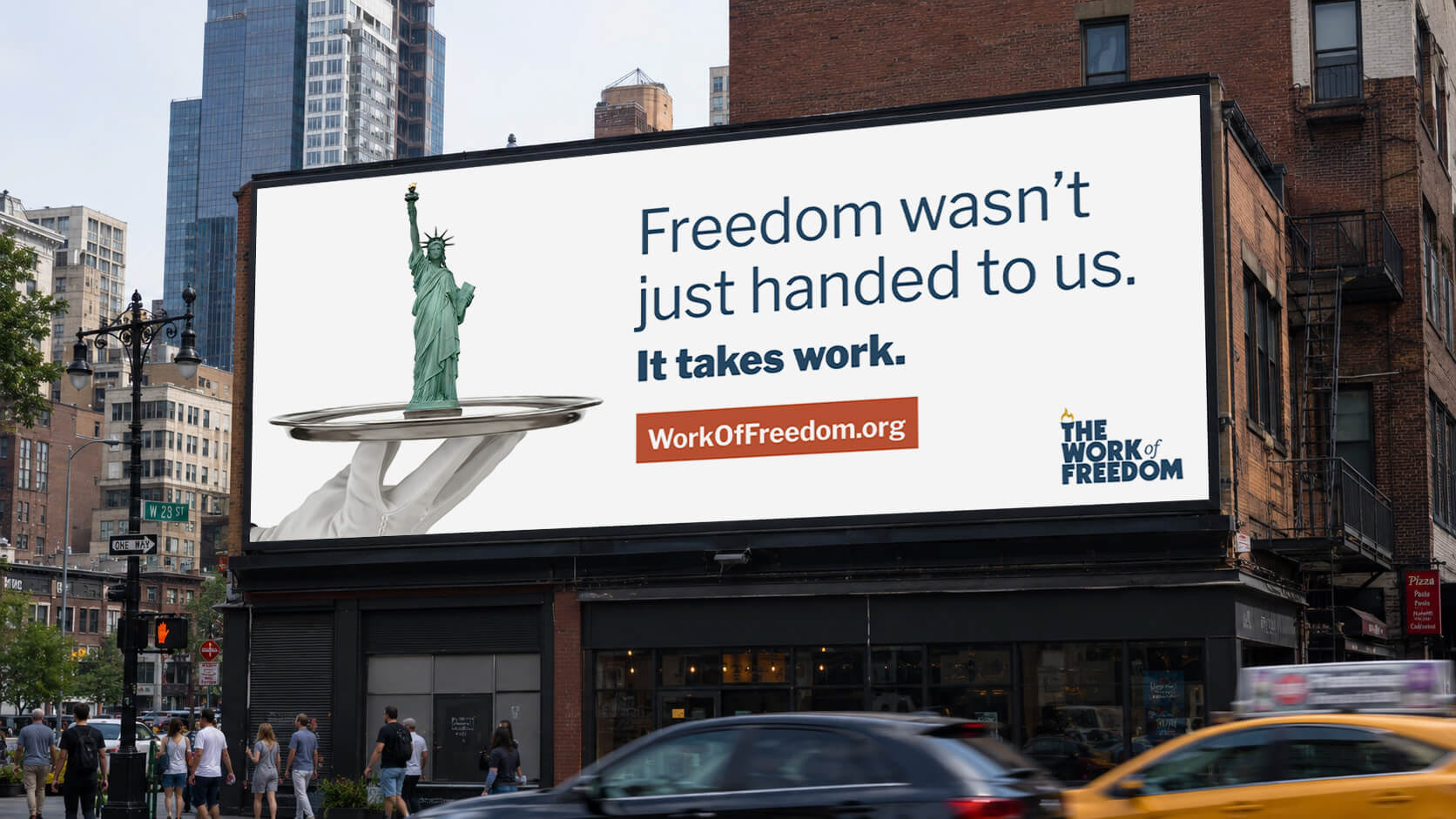
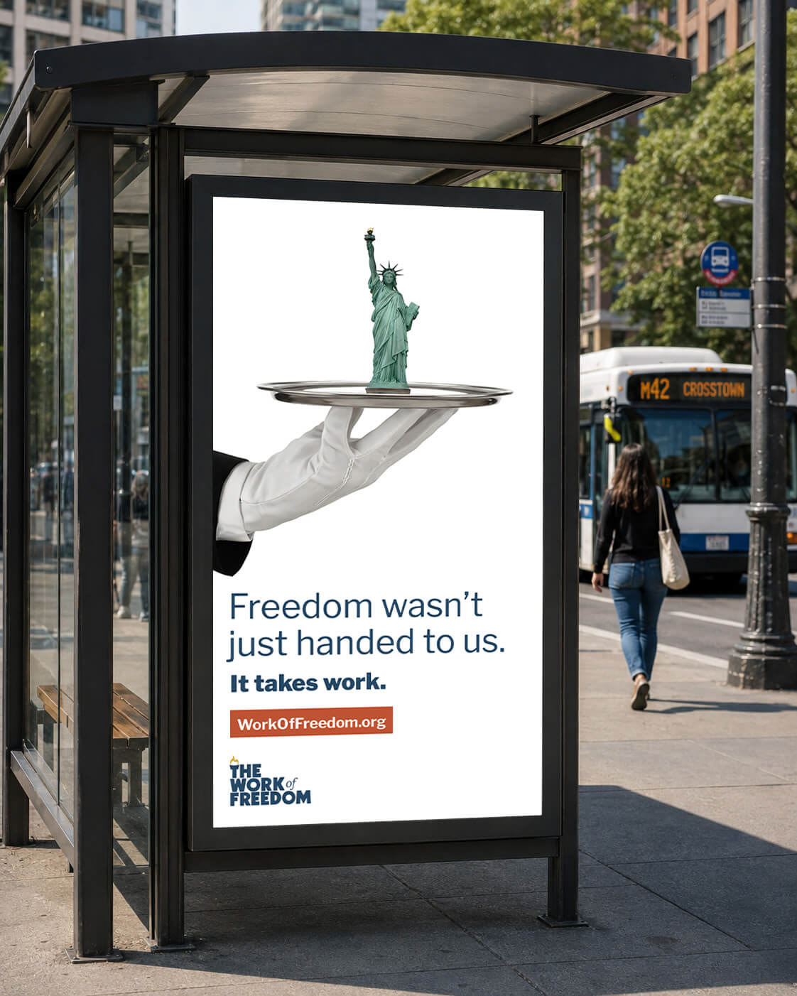
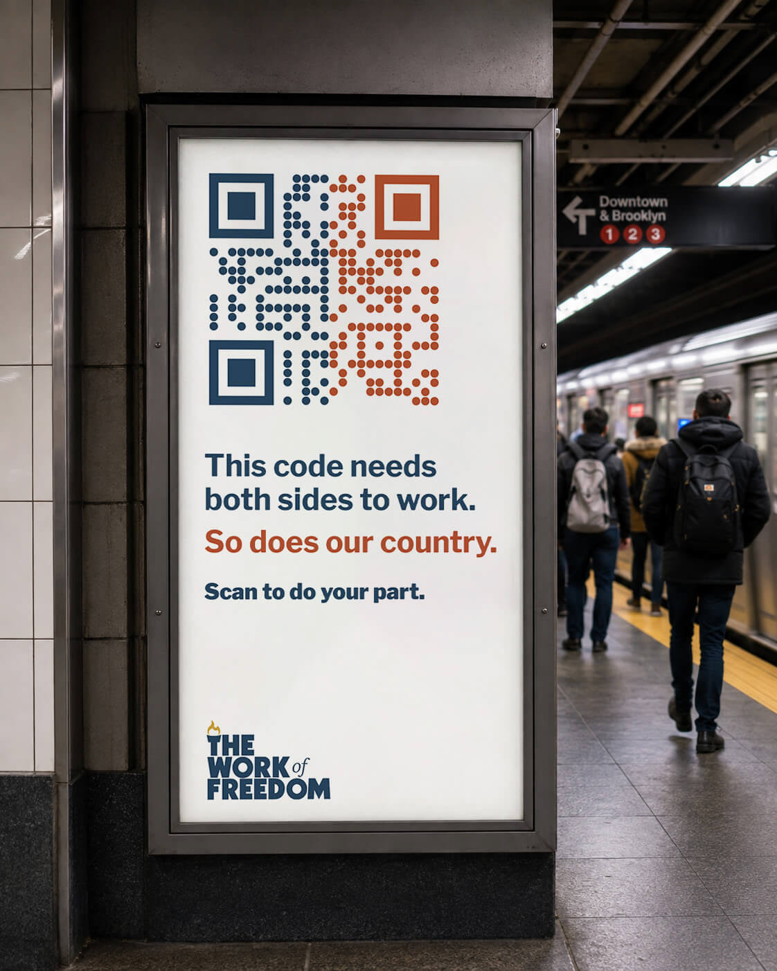
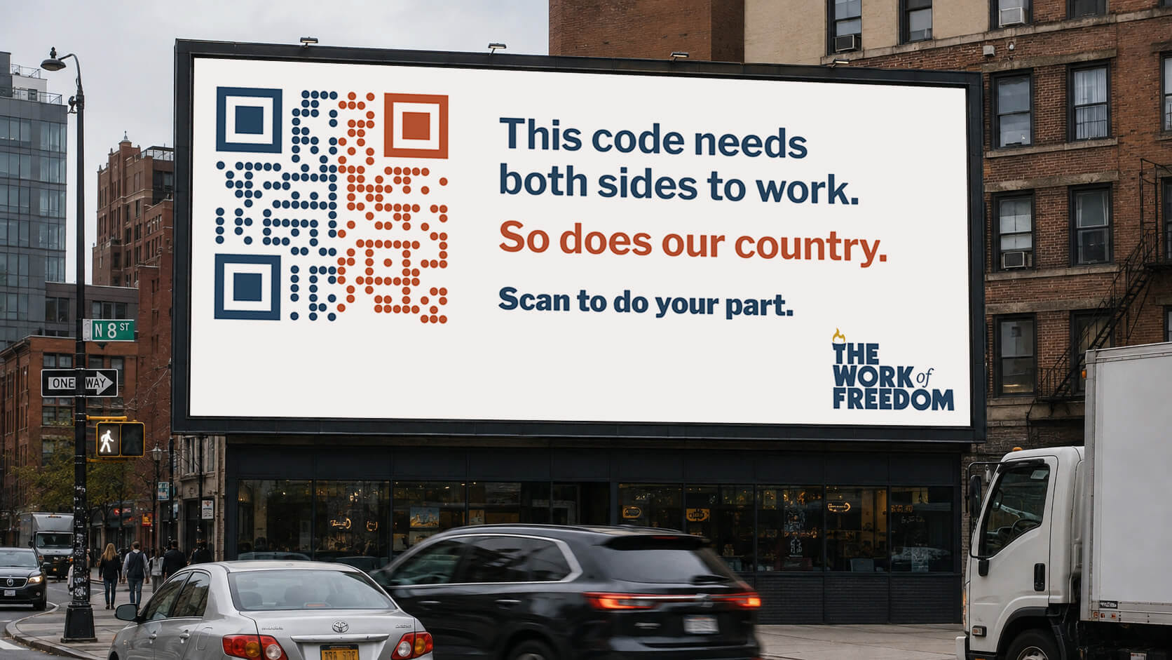
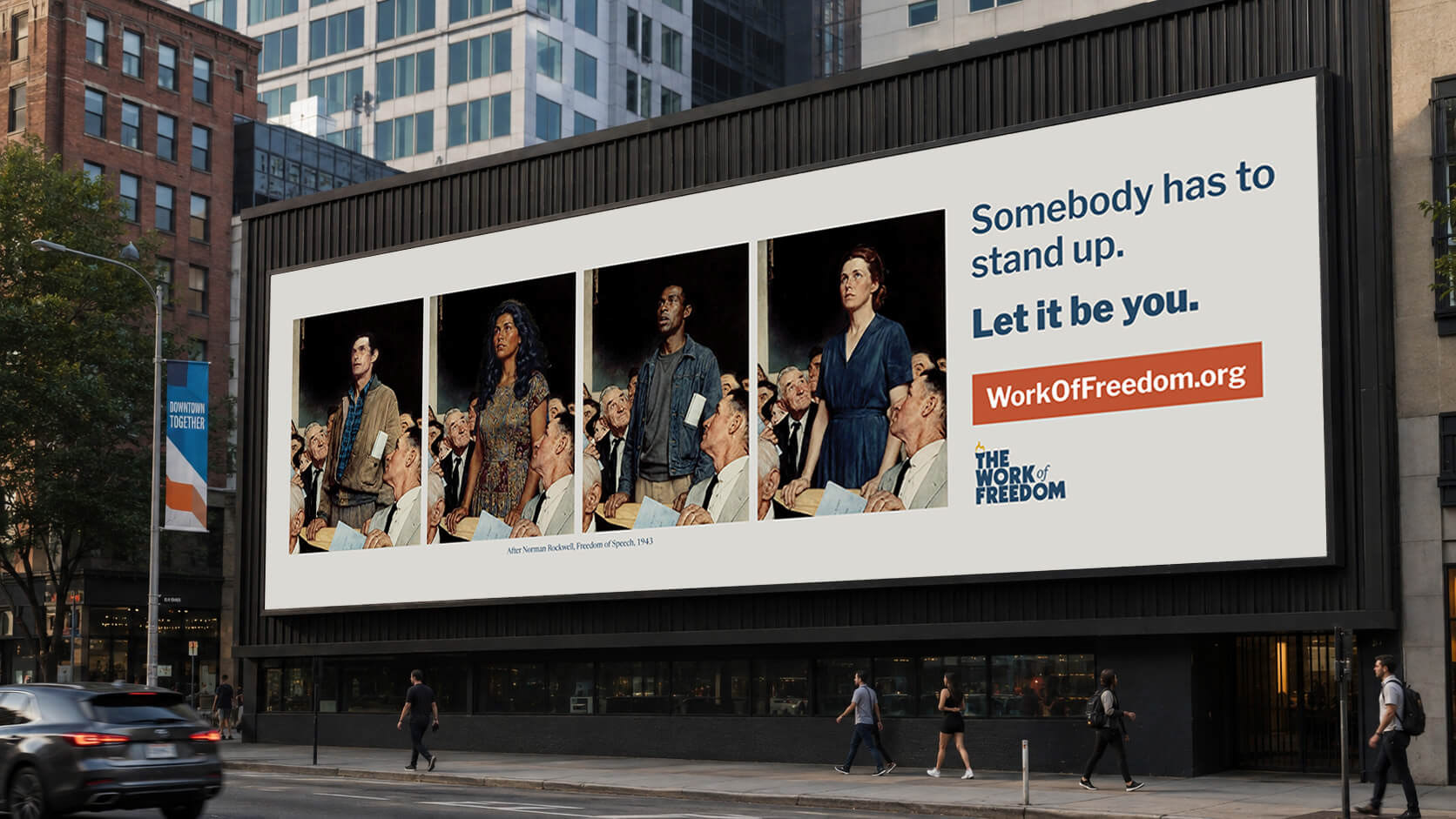
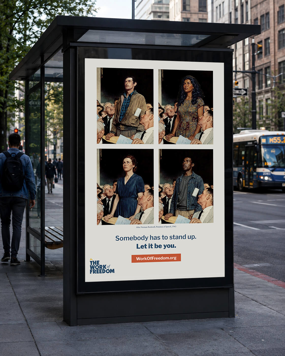
Three concepts, each built as a horizontal billboard and a vertical poster.
Out-of-home advertising gets three seconds and no second chance. So every board works the same way: take an image Americans already know how to read — a silver platter, a QR code, a Norman Rockwell painting — and turn it into communication about what it means to work for freedom. The picture does the arguing. The line only confirms what is already realized.
The concept of Norman Rockwell's Freedom of Speech is expanded say to the viewer that any American has the power to do the work of freedom. This piece is in the public domain, but Rockwell is credited on-board anyway.
Social Carousel
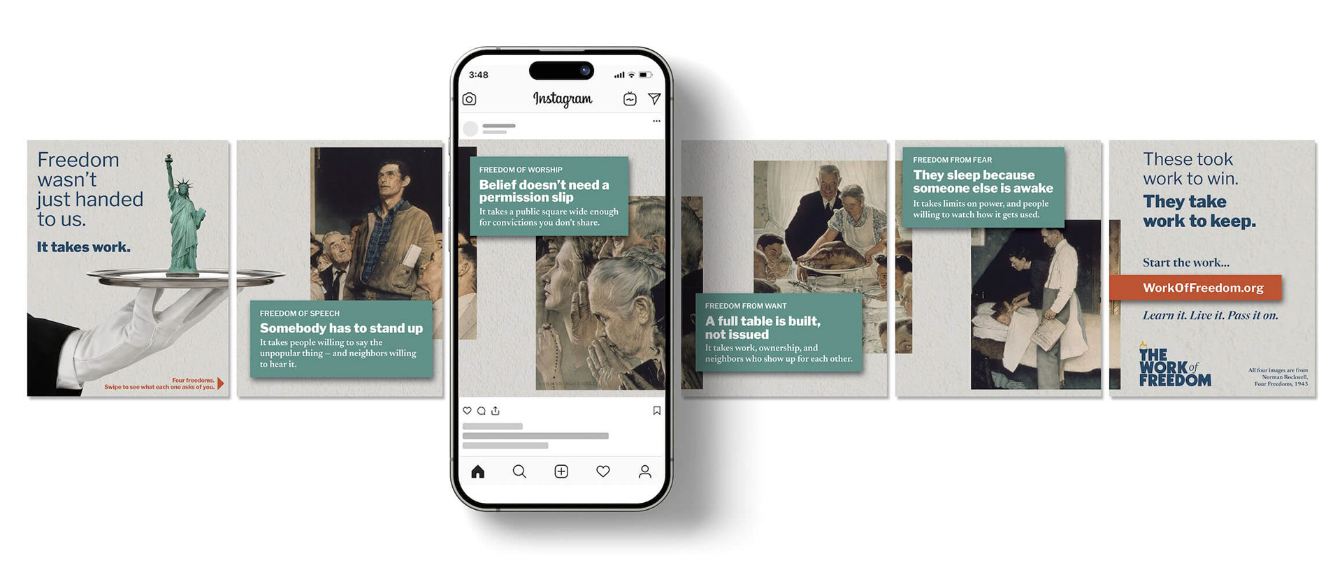
Each frame “spills” into the next to communicate the connectedness of Rockwells The Four Freedoms (all of which are public domain), each reframed from a gift into a responsibility and call to action.
A full table is built, not issued.
A full table is built, not issued.