Overview
Young adults aren't opposed to family. They've accepted a story that it's what happens after your real life ends.
Gen Z, Gen Alpha, the youngest millennials, the deliberately childfree. They've been told a child is a subtraction — from freedom, ambition, the years that count. The political answer to that in some places has been tax credits, but nobody starts a family because the math improved. A culture that has learned to price a life instead of value it won't be argued out of it by a better price.
In another sense, Americans who do want children consistently report wanting more children than they end up having. That gap isn't about desire, it's about permission.
This campaign doesn't debate the audience. It seeks to reframe the discussion.
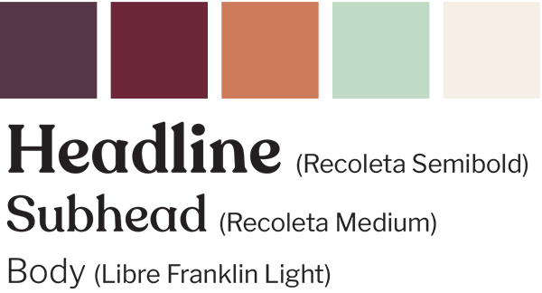
Feminine without pandering
Recoleta is the soft and inviting header font paired with Libre Franklin. Plum, burgundy, terracotta, sage, cream. Women are the likelier primary audience, but this isn't a decision women make alone, so the palette has to be warm without becoming women-only. Depth and earth instead of pink — colors that evoke life and parenthood rather than gender. Sage was chosen to be a nursery color that can be found in any nursery reglardless of gender.
The fonts were chosen with the same rationale of leaning feminine but not so much that men would think the message isn’t also for them.
Getting to The mark
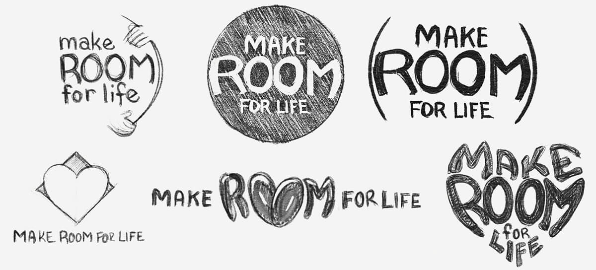
Six directions. One idea. All centered around the idea of making room, some with a heart shape trying to break out of a mold or having typography bend the space it’s in to “make room”.
The winner made the words into the heart, combining the two main directions being pursued — four words made to fit, because making room for a life is exactly what we all do when we choose to love. The mark performs the proposition in addition to illustrating it.
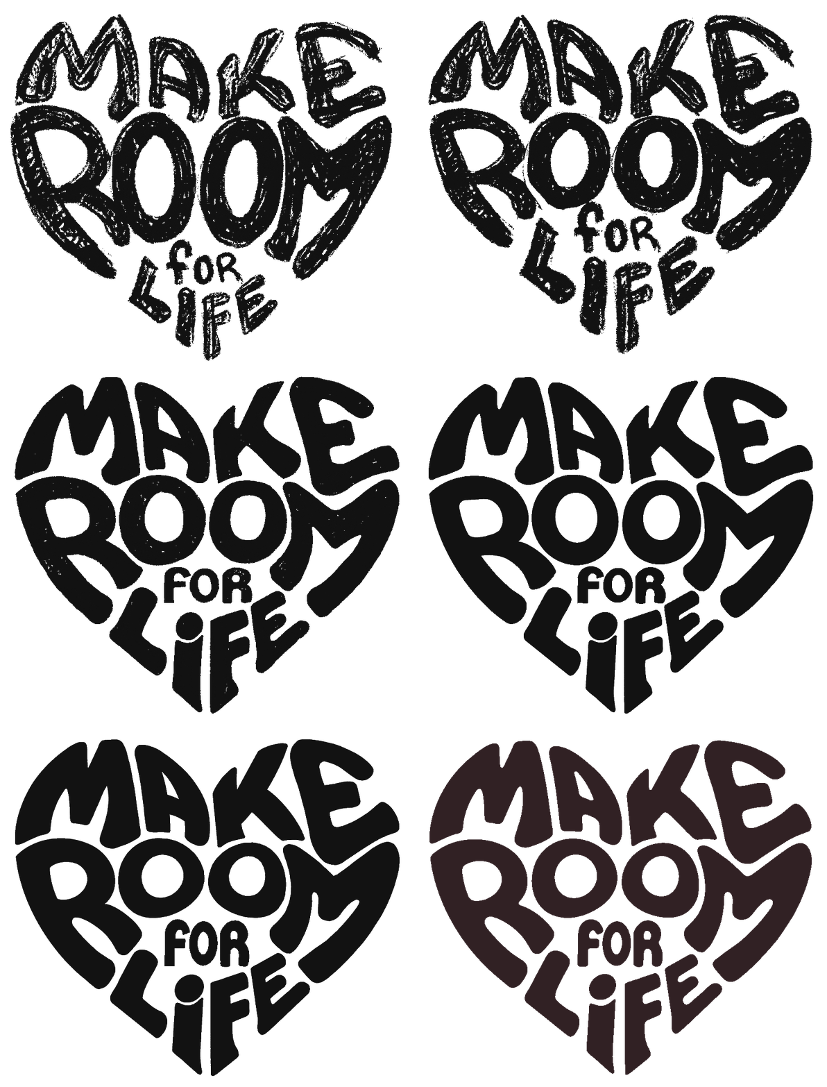
From pencil to vector. It was important to have the mark look like it was handmade (and until it was vectorized it was), life is organic, the design of the mark is also the call to action and it should likewise be organic.
Landing page
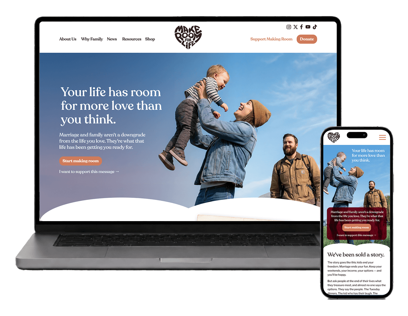
The flagship piece for the campaign.
The joy of parenthood is the argument being made, so the page shows it instead of claiming it. In the hero the child is the highest part, being held up by a mother’s love, and the figures and text are structured in a way to point to the child. Moments throughout the page are displayed in Polaroid pictures and a photo booth reel.
Polaroids, which still convey feelings of nostalgia and good memory, reveal on scroll. A crawling baby appears over an empty floor. A woman surrounded by help appears over the same woman standing alone. Each one is a window into what could be, not a picture of what is.
The whole page is framed in a heart shape further reinforcing the concept that making room for life has love at the center of it.
Social-First Promotion
This audience doesn't encounter causes on billboards or television commercials. They encounter them while doomscrolling their social media feed.
This reality sets the whole media architecture. No 30-second spot to cut down, no print ad to resize — the work is built where the audience already is, in the native shapes of the platforms they live in: stories with real polls, a carousel paced for the swipe, a reel that looks to give motion to a message about life.
Social media messaging lets the campaign arrive the way a friend's argument arrives — mid-scroll. Earning the next tap is the whole job.
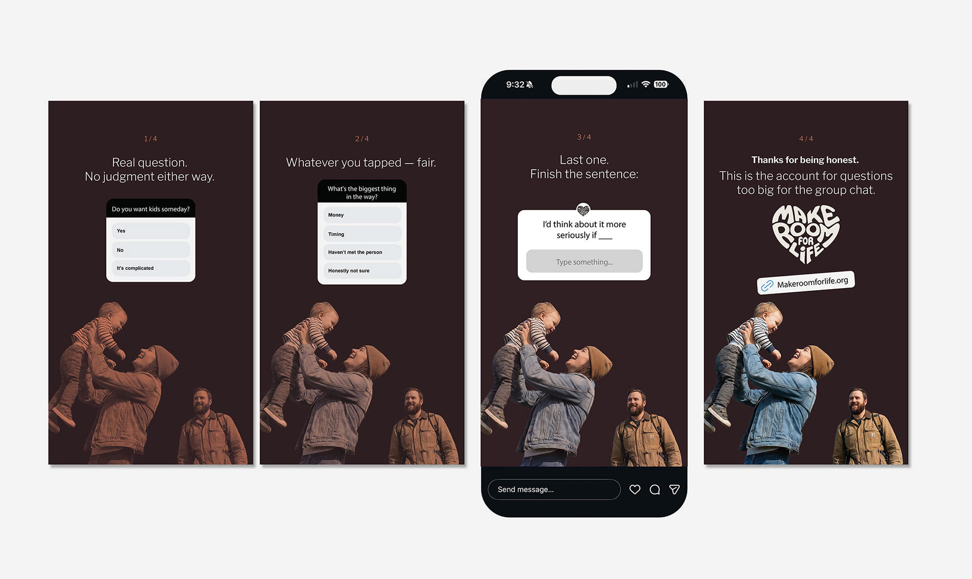
Story sequence, 4 frames.
Instagram stories. Two polls, a question sticker, a link. Four frames and no argument made. The color warms as the questions get more personal, and the mark waits until the end, after the audience has already answered.
The account asks before it tells. This is the account for questions too big for the group chat.
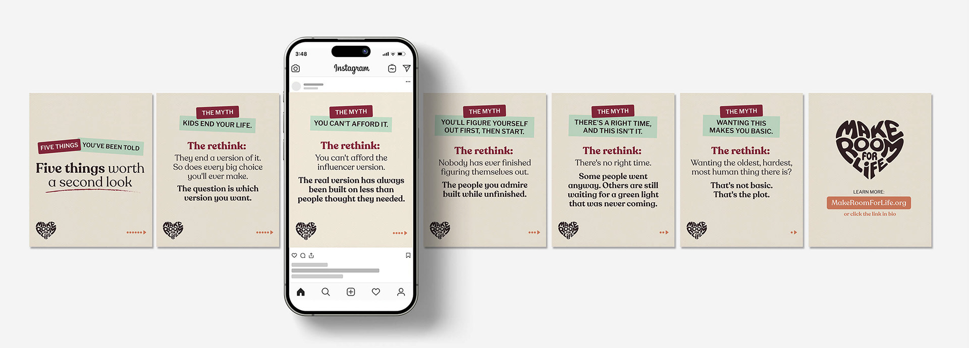
Carousel, 7 cards.
Myth / rethink carousel. The myth is set in the sans, on a tape strip — a quote from the outside world. The rethink is Recoleta, and the weight increases upon progression so the last line lands hardest.
The myth blocks are tilted at opposing angles to give the feeling that they’re not stable ways to view them. In addition to being bigger and bolder the “rethinks” are also displayed straightforwardly to reinforce the idea that these responses are stable.
A reel that looks to show, not tell
The camera starts at the window — brownstones, a city street, a room with nothing in it yet. It never cuts away. The apartment fills instead: a sofa, a play mat, toys mid-air, laundry, a baby crawling straight into the lens.
The captions are the objections, in order, are what is typically heard from this audience. Not yet. Not until the job's steadier. Not until we've traveled more. Not until we're actually ready.
Then the turn: Nobody is. After that is the reality check about “waiting — it rarely arrives on schedule.
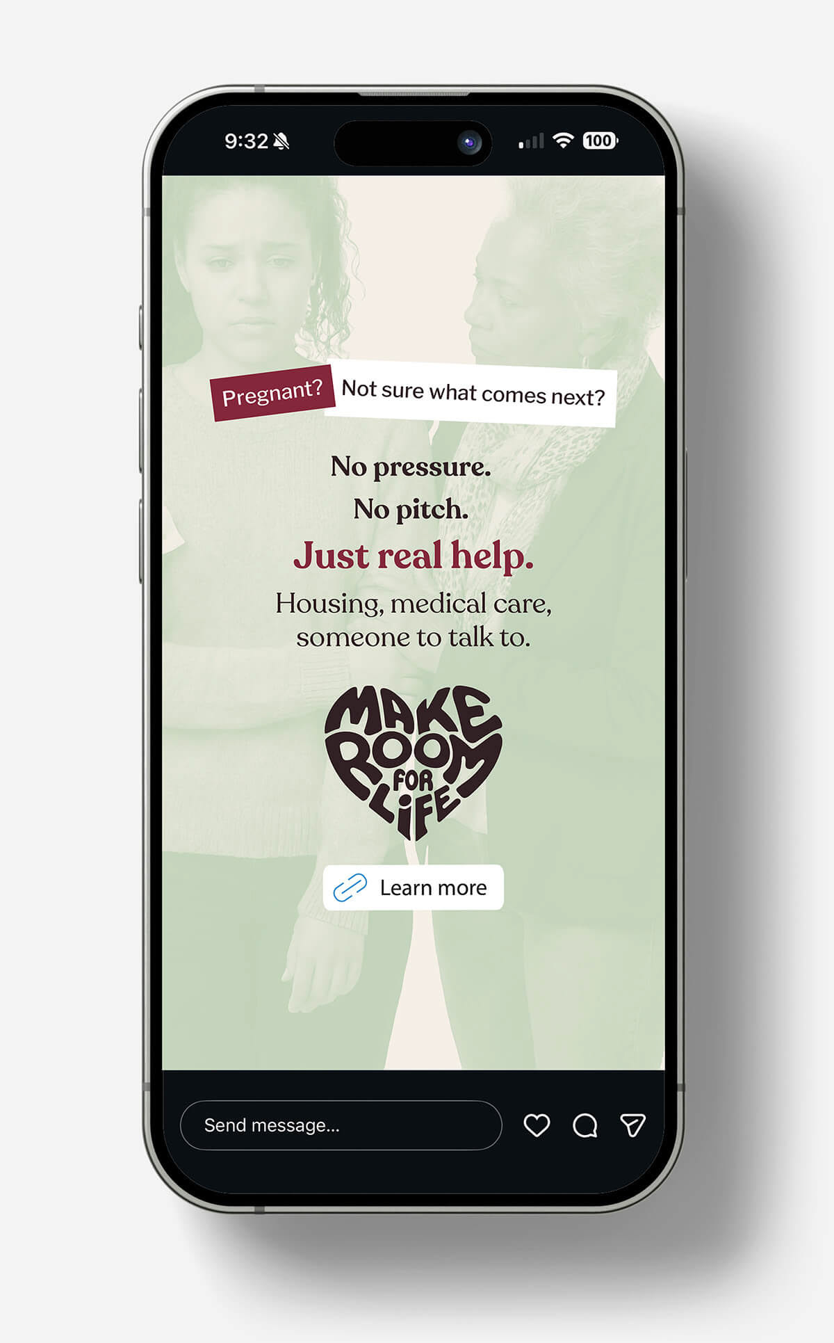
Support-register story ad
Support register. No pressure. No pitch. Just real help.
The composition is set up in the same sort of chaos and then order arrangement seen in the social media carousel. The negative space is set up to help frame and point to the content.
The mark isn’t just a fitting way to conclude the message, it also points to the learn more button, visually leading the viewer to the call to action.
Email
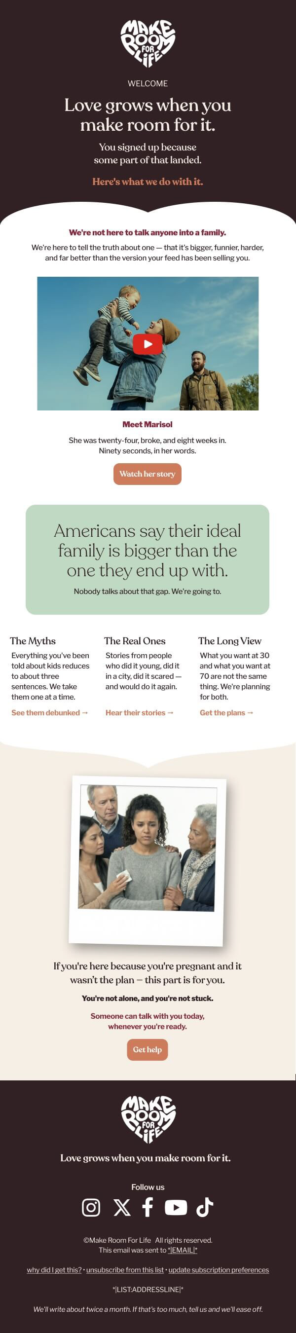
Welcome email. Email is read section by section, not seen at once — so it's built as a sequence. One piece of the argument per scroll.
Like the landing page the content of the email is contained within a heart.
Finally, the eye is led to the CTAs with the use of an inverted pyramid, allowing the text to point to the button, visually prompting the user to notice the action intended for them to take.